AIA banner mockups
1. Relatively few images, both logos at top. We would need a pretty large render for the "hero" image. Probably at least 5000px.
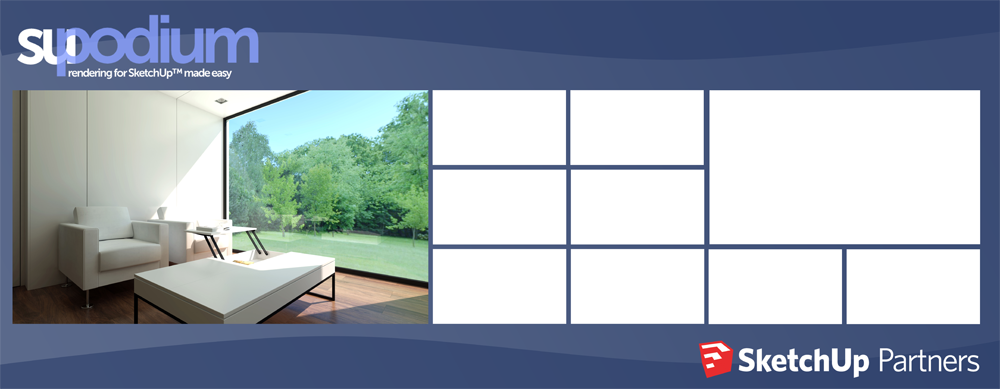
2. Just tried the partners logo at the bottom to force the images up to a more comfortable viewing height. I think we probably want it up top though, since the red SketchUp cube is recognizable and will bring people to the booth.
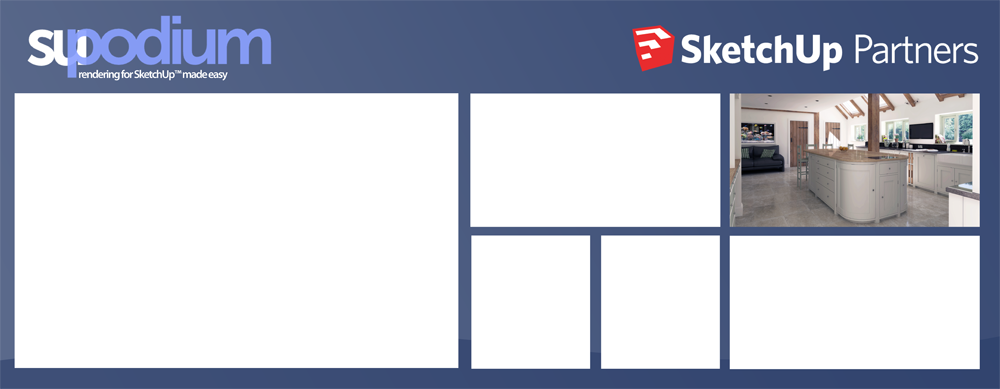
3. Still keeping it pretty simple with this one, maybe a couple vertical images.
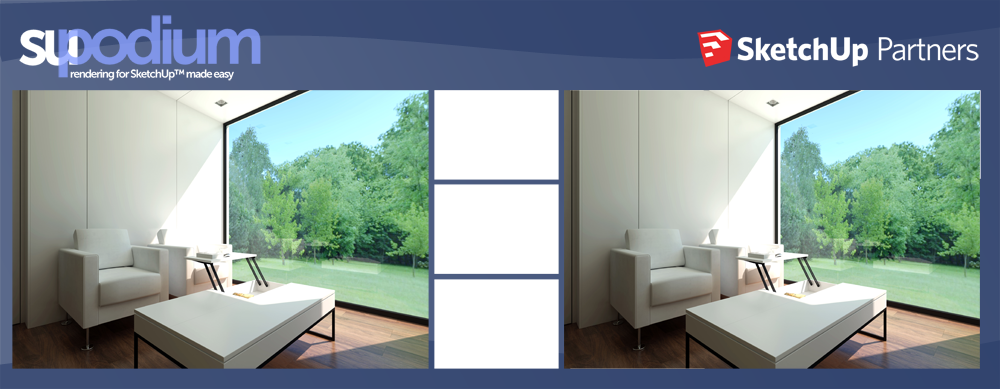
4. Just trying two large images here. That middle column could also just be taken out entirely if we just wanted to keep it really simple.
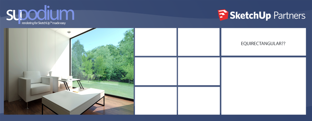
5. More images, possibly with an equirectangular example? (Please ignore the screwed up Podium logo for this one.)
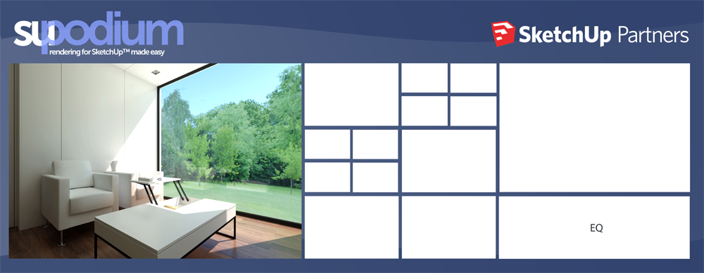
6. And the maximalist option. I do like the idea of having a lot of images for people to look at, but we obviously need to figure out where the art is going to come from if we do something like this.
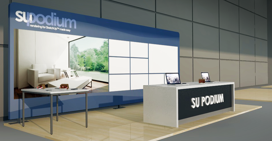
Approximate scale