Overview
The goal is to provide a list of one-click post processing filters that immediately add style and appeal to a render, ie Instagram, VSCO, etc. But the current set has a lot of issues; most are too saturated or too strong. Some produce effects that are inconsistent with the name of the filter (desaturate, for example).
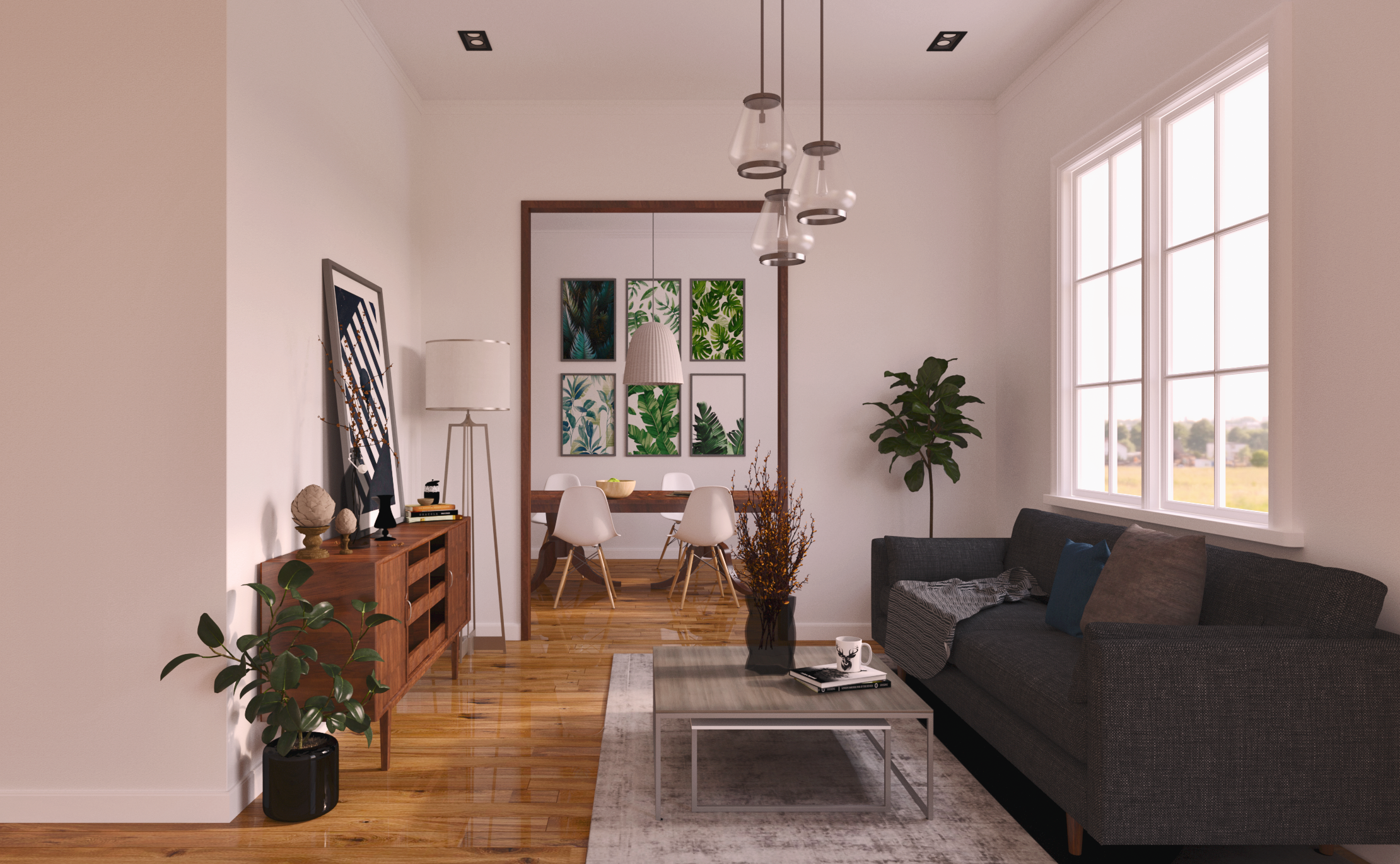
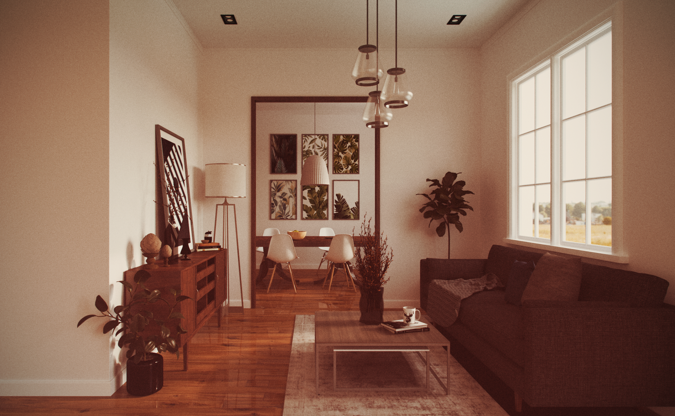
Raw render with no processing
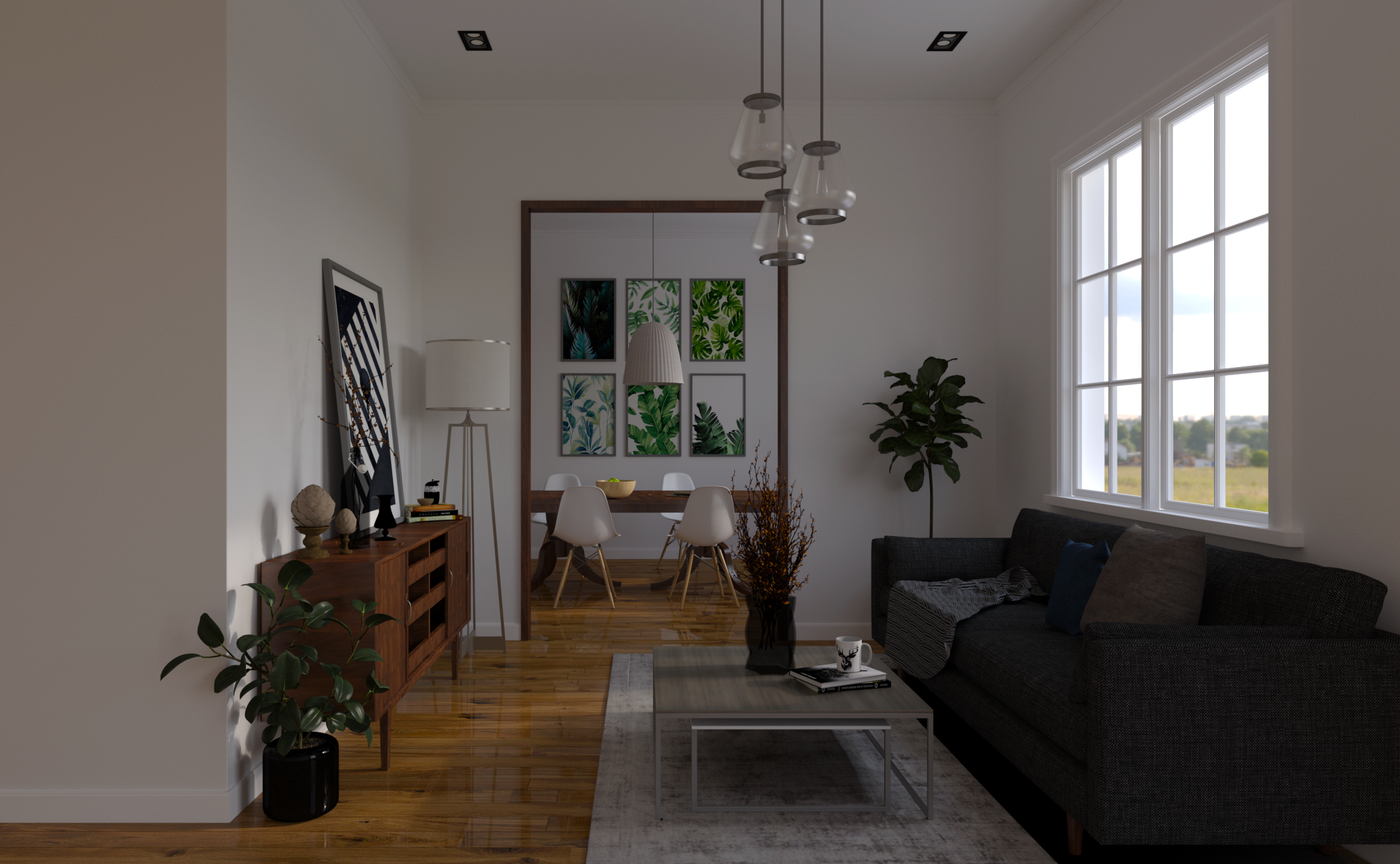
We start with something relatively neutral, maybe somewhat under-exposed. A pretty standard result for an interior image with no artificial lighting, and intensity/exposure sliders at middle values. A picky visualizer might re-render, but this is well within an acceptible vaule range - really the only area we're losing detail is under the couch, and it's better to under-expose than over-expose.
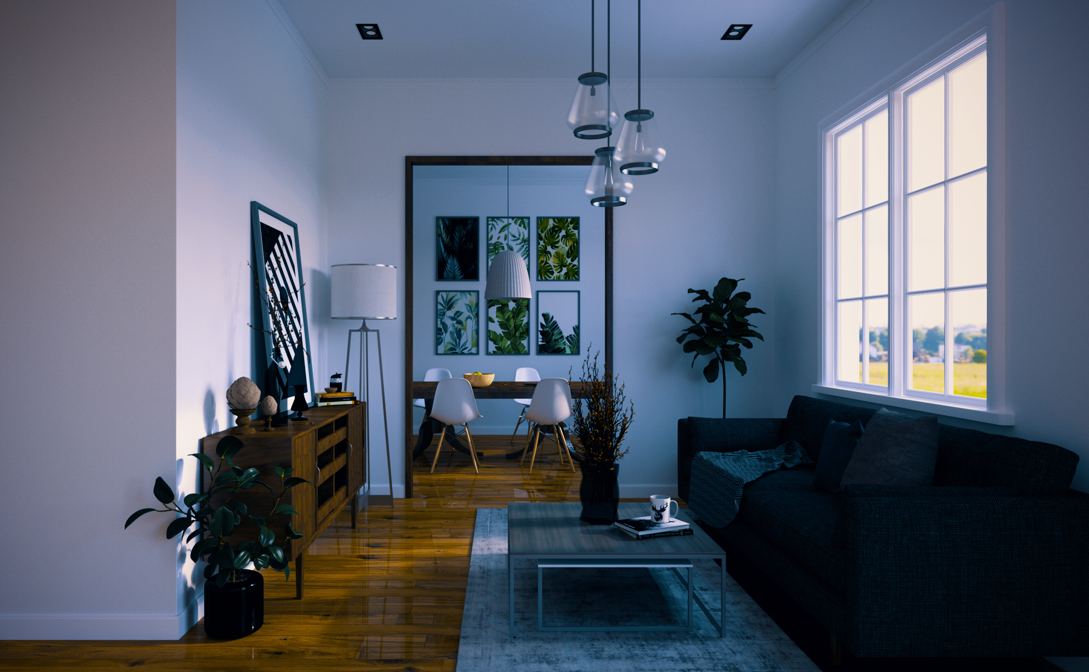
Target images
I tried to create several distinct looks without going too over the top. I think the upper right and upper left are probably the most universally applicable. The rest are attempts to mimic some of the filters available from other editing applications. Some of these are roughly based on color grading lookup tables (LUTs) available from VSCO, which is a pretty popular tool right now.
Note - Dave, I don't know how DMMD will actually build these filters, but it's possible they are using something akin to "lookup tables" behind the scenes (which is basically a hard-coded image transformation written into a file) — if this is the case, it might even be better for me to just provide the actual LUTs that I used for some of these. Though some of them aren't free.
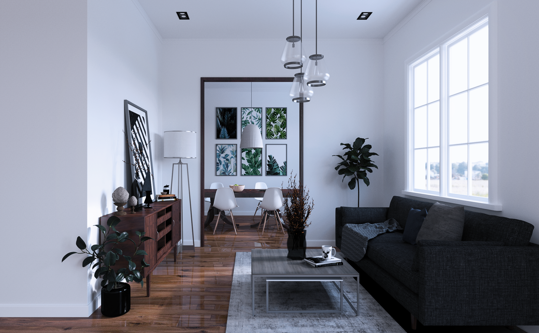
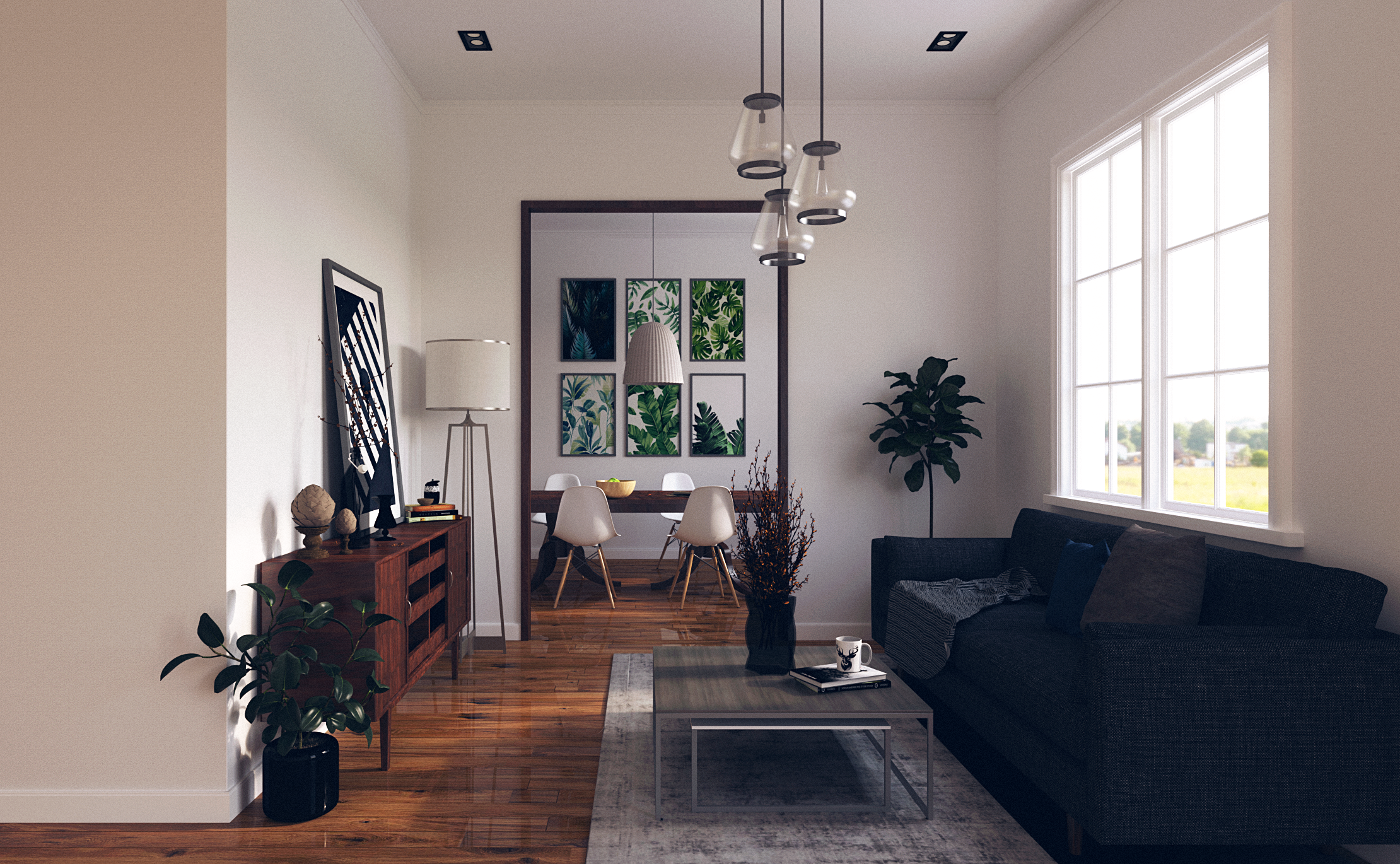
COOL BRIGHT
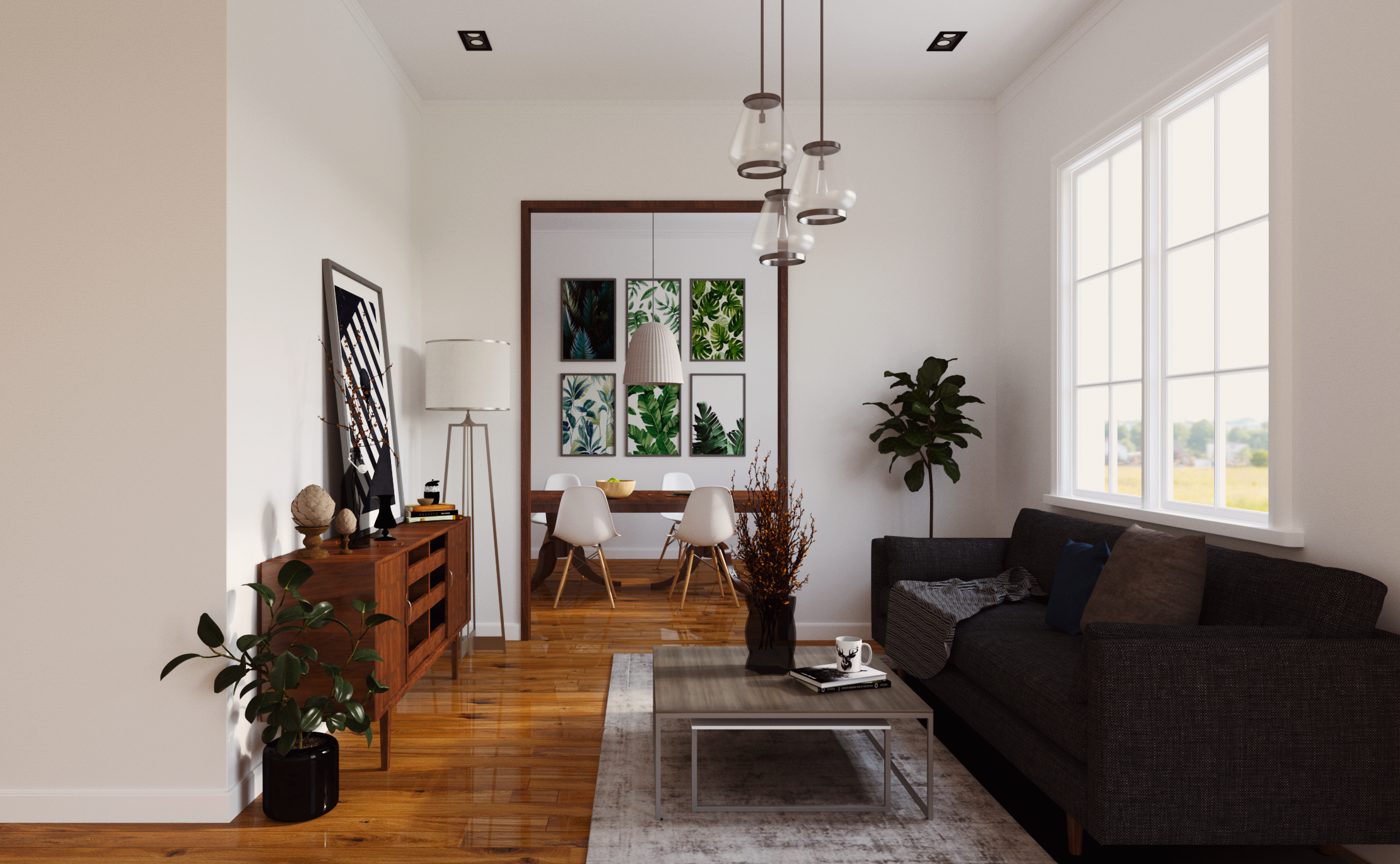
SUNLIGHT
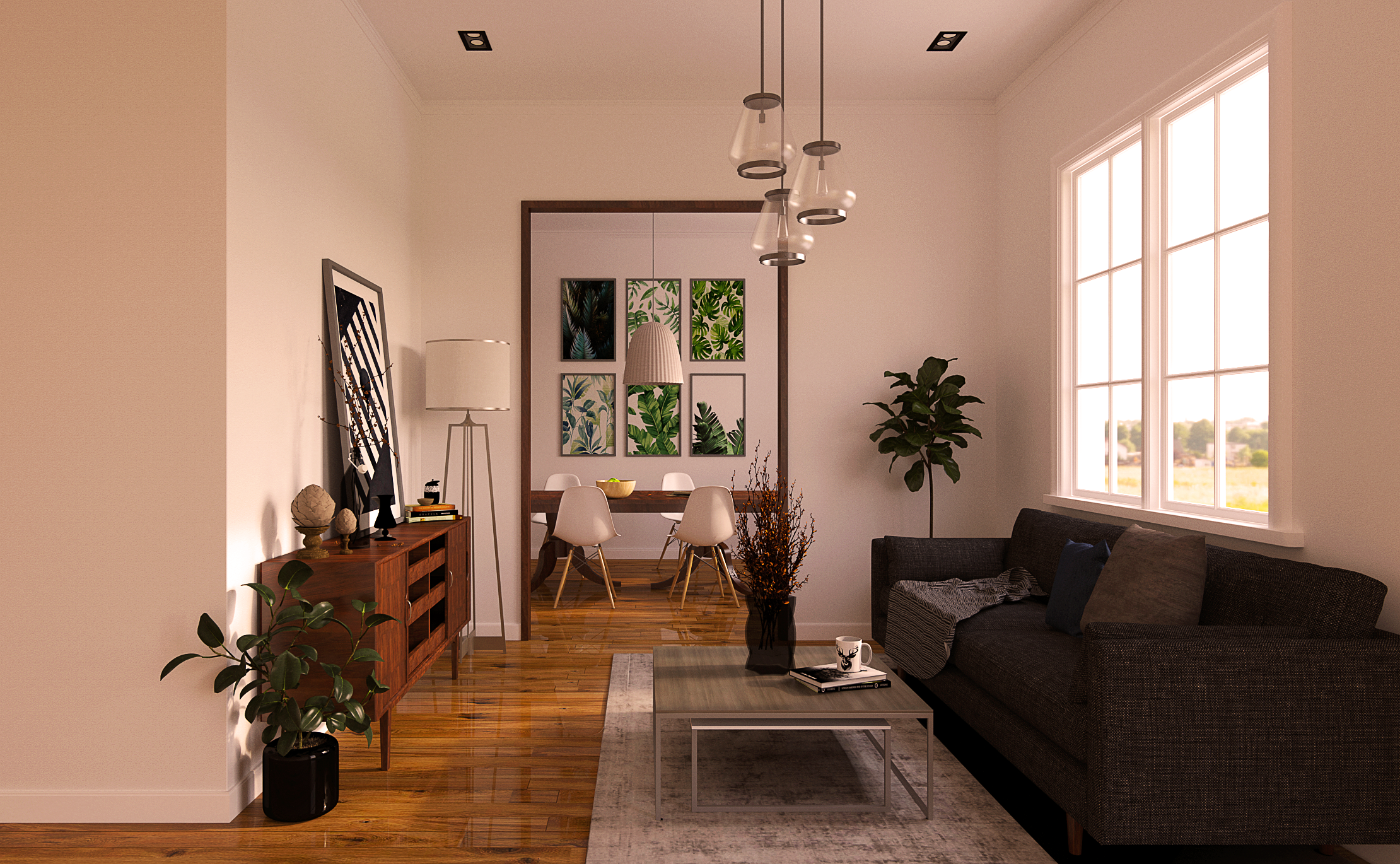
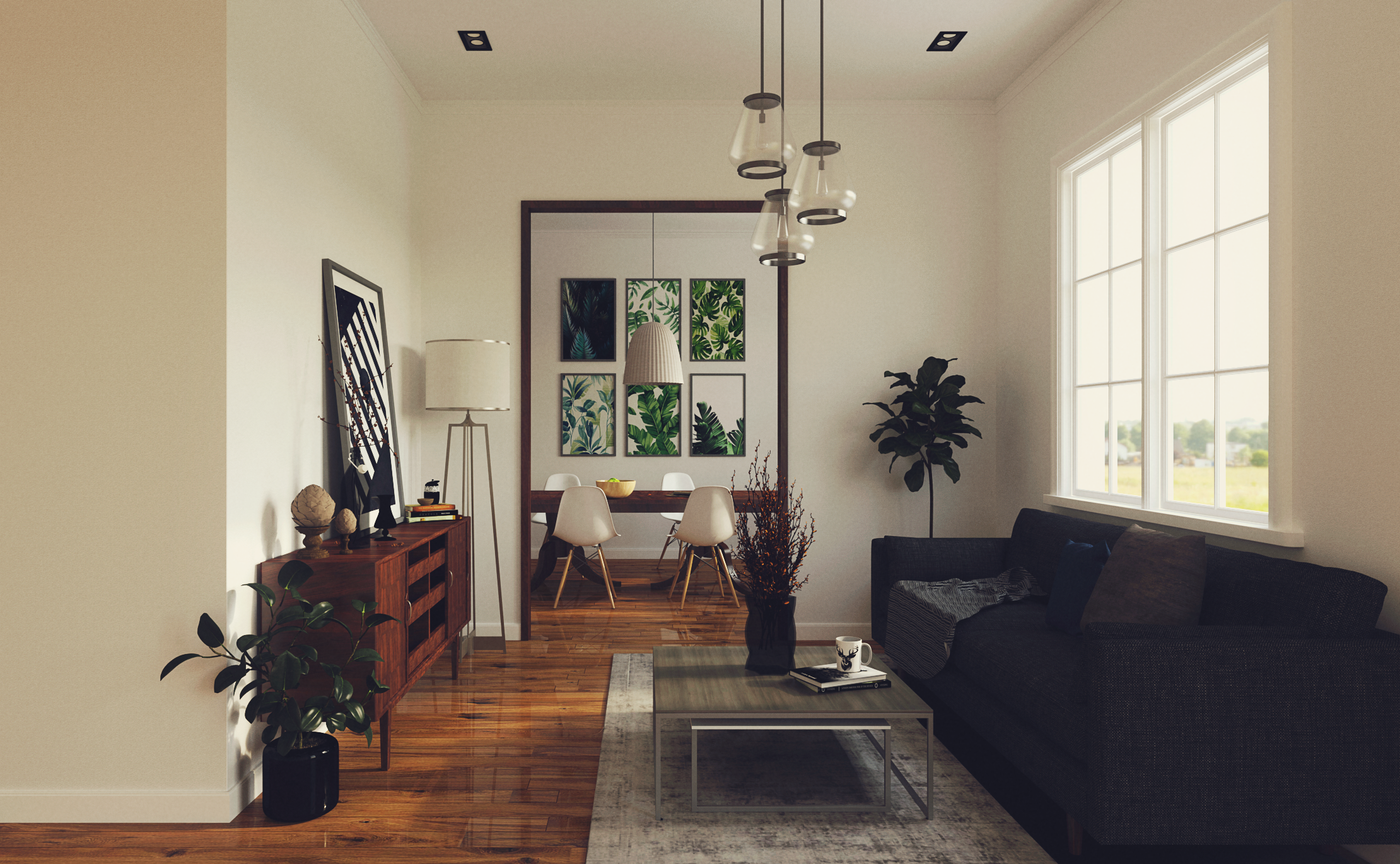
WARM BRIGHT
RETRO PASTEL
VINTAGE FADED
RETRO CREAM
Stylized / More extreme - I could do a million variations that go further toward an extreme look, but they are usually less practical.
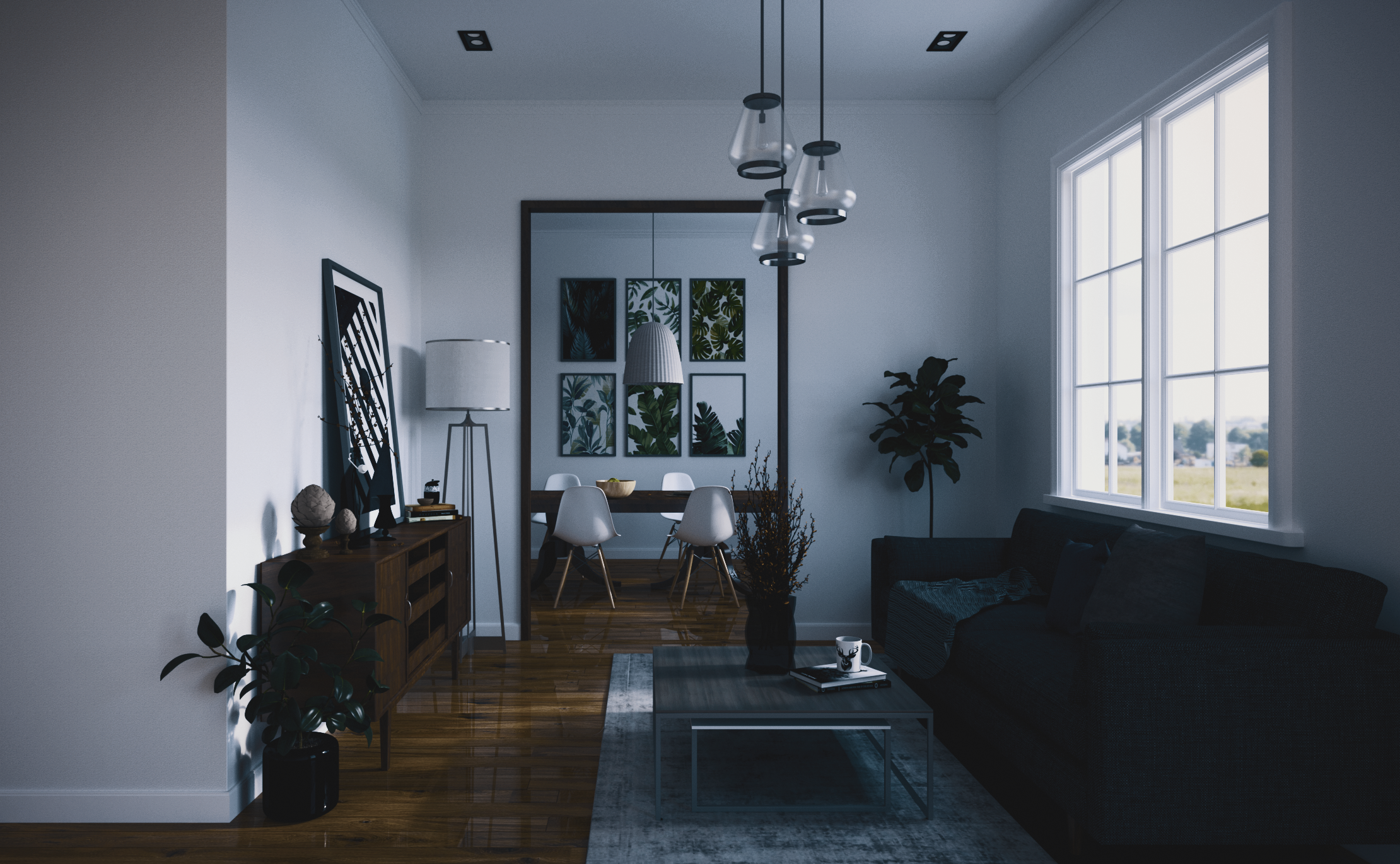
DESATURATE MOODY
RUSTY ANALOG
MOODY SPLIT-TONE
Instagram is a great reference for filters that push further toward stylized looks, but I think that type of processing is less useful for the kind of work our users do.
Details
I'm not exactly sure how these PIE presets are made, so I'm not sure what information to include. I have attached the original Photoshop files, and I can write out a list of the post-processing steps for each one.
What I think might be more useful is to
1. Bright and cool
2. Bright and warm
3. Soft sunlit
4. Vintage Faded
5. Vintage Pastel
From the existing presets, I think there are several that can stay:
1. Nick's 2.