About the Author: Nick Harvey
Hi everyone, Nick here. Some of you may have seen me on the forum or read the Podium V2 guide I’ve written. For those who don’t know me, I’ve been aboard the Podium team for over 7 years doing mainly tech support and developing Browser Content. I’m also a soon to be Architect and render enthusiast who has done a fair share of rendering with Podium.
In this new tutorial series I will take user submitted renders/model and demonstrate how they can be improved. This is the result we're working toward:
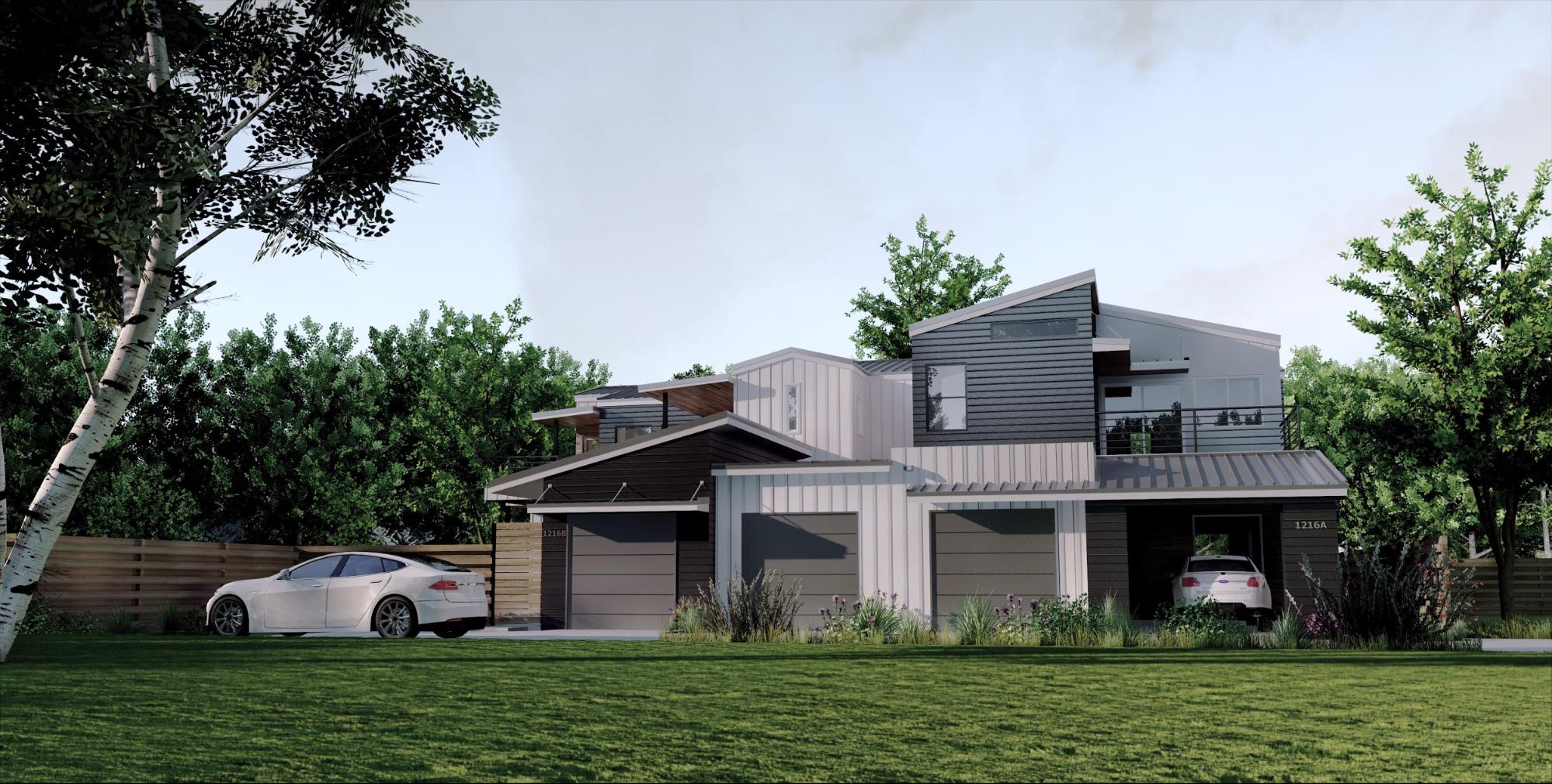
Nick's final image, created from a user-submitted model. See the starting image below.
We won’t be making perfect flawless renders, but will show how to easily and effectively get the most out of Podium to produce the best image possible from your model, and provide knowledge and tips you can use for you everyday rendering needs.
I will talk about different subjects as they come up while working on your scenes. Since each entry will be different, I’ll try not to repeat past explanations. If after reading you feel you still need more info or have questions, I’ll be happy to answer them in the next post, or when the subject comes of interest again.
About post-processing: I have been a long time Photoshop user, and will always use it for my renders. Post-processing is an essential part of rendering, and we can’t make an exception here. Nonetheless, I will strictly use Podium tools and content for the tutorials. No Photoshop. Only browser items and Podium Image Editor for PP (Post processing). I often point out that newcomers ruin their render with bad Photoshop. Using only Browser items will be fast, easy, and provide much more realistic results.
Naturally, this series relies on your user-submitted render and models. Please submit through mail or on the Forum if you are interested. Make the best renders you possibly can with your scene and send us your final render along with the model. You’ll get a free image and your model back, guaranteed.
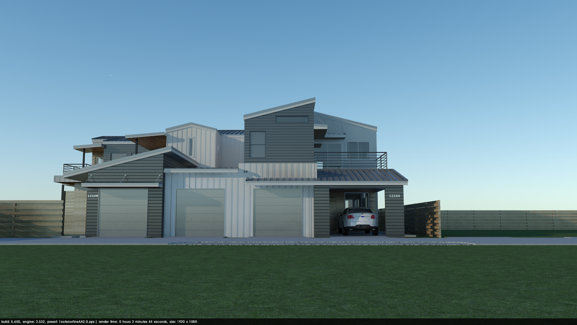
For the first of this series Andrew was kind (and brave) enough to send us his model. He found that his render was bland looking.
Optimizing render speed:
No matter how good you are, rendering is still a trial and error process and faster rendering times will help streamline your workflow. Before we begin rendering, we want to take steps to bring down render times and make SketchUp navigation faster.
2. Choosing a point of view:
The first step into rendering we’ll take is to set a point a view.
Think like a photographer.
Like most things rendering, framing the view is an Art. There are lots of tutorials on the web about photography framing tips that are totally relevant to rendering. The rule of thirds is a great starting point.
The original point of view does not have a human perspective. You will rarely see architectural photographers bringing ladders to their shooting session. They are more likely be seen crouching around trying to bring a more impressive sense of space and perspective. Same goes here.
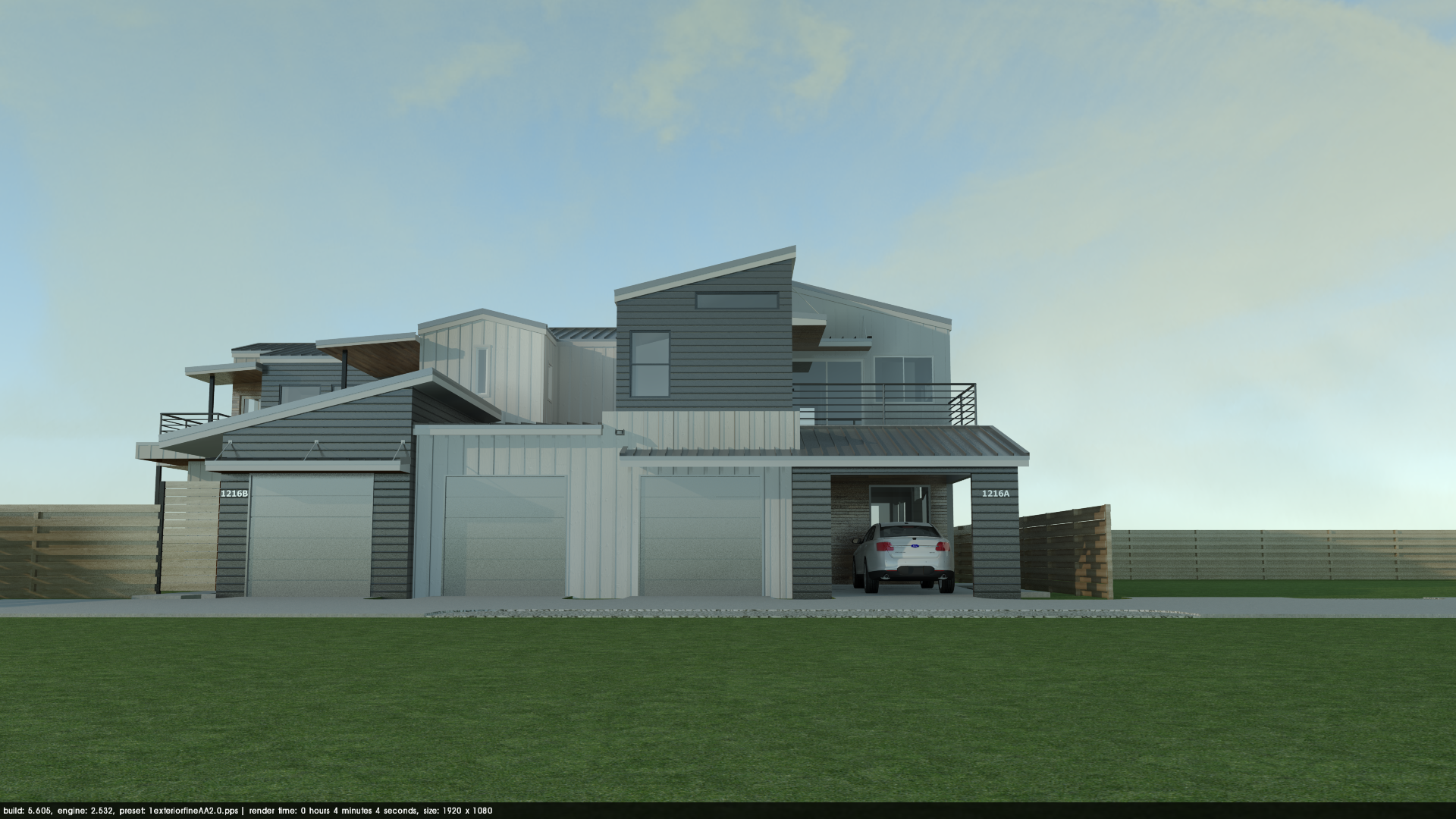
We will fine-tune the point of view as we gain a better understanding of what the scene is about, and build up the environment. I started with an almost true perpendicular view because I thought it would work well with the house - this tones down the complexity of the structural volumes and brings a cinematic feel.
3. Materials:
Let’s get down to materials. The main issue Andrew had was his overexposed white boarding material. You should avoid 100% white and black colored materials simply because they will look flat and lose the geometric details they may have when rendering.
I replaced the texture with a white boarding (PDM Planks 02) from the browser to communicate a bit more detail, and made it slightly darker to avoid the initial issue.
Glass: I toned down glass reflection to 10% (5/85/10), added 25% blurred reflection to the roof material (modeled seams make it look really good) added 15% reflection to the handrail material and made it less dark.
Metal: For all your metallic material needs, 15% blurred reflection with a simple flat color as a texture is the key. These settings will work with flashings, window frames, garage doors, handrails, most powder coated and anodised materials, and more. I used more reflection on the roof materials because it looks good but 15% would work just fine. Make sure you make it blurred; 15% flat reflection will look extremely polished.
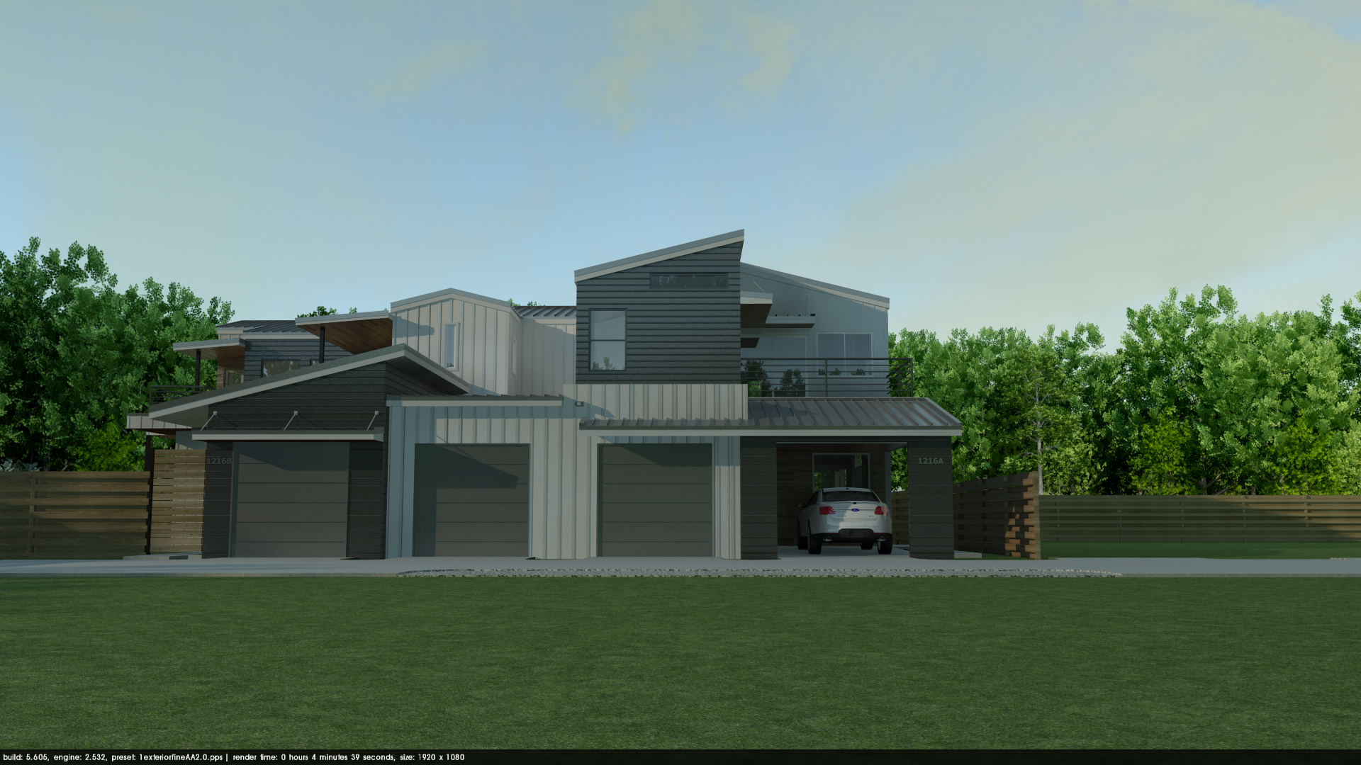
Fence: I also changed the fence texture to something less repetitive and vivid (PDM antique 1 from the Browser). Make sure you always paint your wood texture along the long side of the planks—this is really important, especially with furniture.
Tip: To reduce the repetitive look of the material, I scale it up and make some planks unique so I can offset the texture. This way you don’t see perfectly aligned knots on each plank.
All materials in this scene come from the browser. They are render-ready, which means that most the changes described above would not be necessary if Browser materials would be used right off. This is an extremely valuable resource for saving time, but also learning how to set materials.
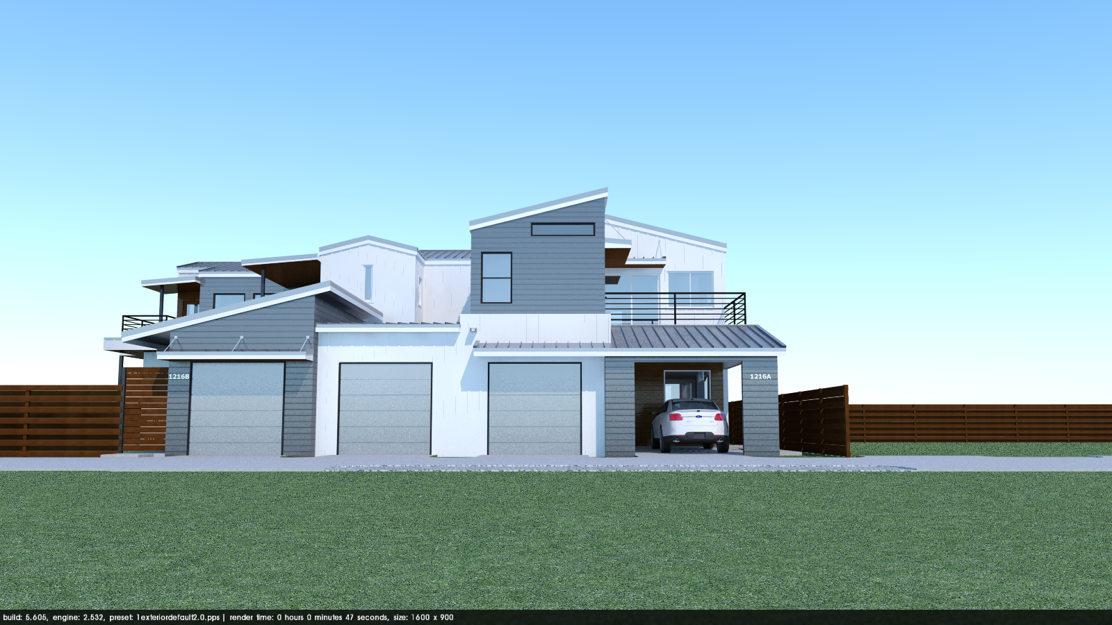
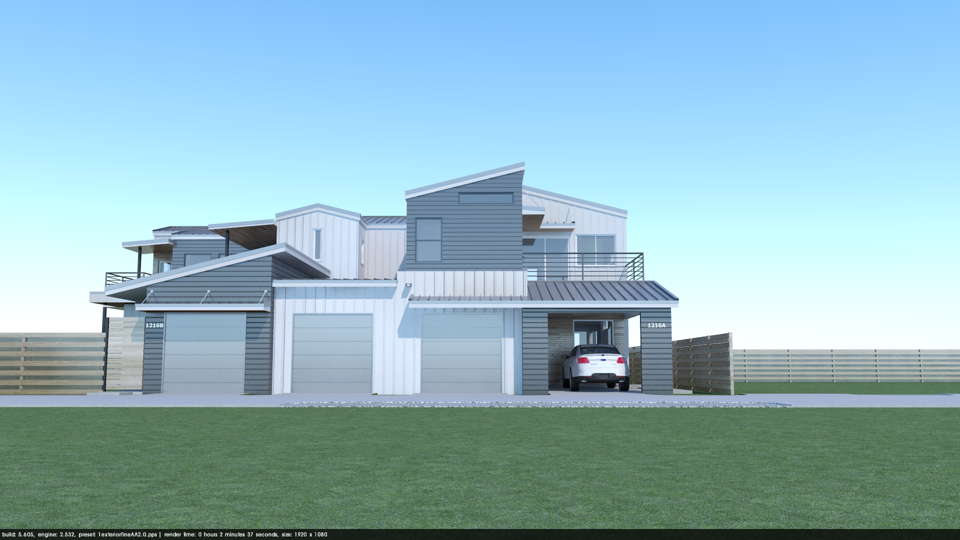
Boarding details will look better when rendered with the fine_AA preset, as the seams will be clearly visible with no jagged edges. Be careful, fine_AA will significantly increase the render time!, especially with vegetation! This is why I only used it for and early material test and my final render, then using Exterior_Default for all my subsequent tests.
Remember - If fine_AA is too slow, anti-aliasing settings can also be adjusted on a per-material basis at the bottom of the materials dialog window.
4. Lighting:
Sun is set at 3:30 PM in October with intensity/exposure sliders at default 50%. We are using Physical Sky 2.
Lightning isn't too hard here, as exteriors are much easier to do. It is nonetheless very important as it will set the ambiance, feeling and depth of the image. If you look at good architectural photography you will notice they are often taken at dawn or dusk. Photographers hunt for what we call the golden hour, which is roughly a 10 minute window at dawn and sunset when the low sun produces dramatic lighting and interesting sky colors.
Many render artists also love that specific time setting as you can clearly see both the exterior and the lit interior. This is in my opinion an overused technique, which I try to avoid when I can. It takes a lot of trial and error to get right, and forces you to model and design lighting for the interior spaces. For this scene, and most of the renders you would produce during a week at the office, a late afternoon setting will produce excellent results.
Tip: Try to avoid times around noon. They will often result in overexposed renders (especially with white materials), and bland lighting with no particularly interesting ambiance or shadows. By setting the sun lower into the sky we will reduce the glare effect and give some character to the image. Don’t worry too much brightness and contrast about now, we will adjust it in PP at the end.
5. Sky and cloud dome:
Typically you may want to add some sky and environment later into the rendering set-up process, but since we are setting the sun position and intensity, this is the perfect time to add a cloud dome from the Browser. Domes will cast shadows on your scene and lower the overall brightness.
Optimize: Since you’ll need a few test renders to make it right, you don’t want be encumbered with detailed objects like 3D vegetation just yet—turn off any high-poly layers. Don’t go full resolution for your lighting test either, 1600 pixels wide will be more than enough.
Browser cloud domes with thinner clouds are easier to work with, and will look realistic in most cases. Remember that you can adjust the brightness of the clouds by scaling the dome up and down—the bigger the dome the brighter the clouds. Here I'm using Stratus_Light_2 at default scale.
The scene will get darker; I compensated by setting the Sun intensity/exposure at 100%. Don’t spend too much time on fine tuning the lightning settings for general brightness, but make sure it’s not overexposed (or drastically underexposed. A bit darker than you’d like is perfect, it will give you room to play with in post processing.
Environment:
Now that our materials and lighting are set we can add the environment.
Background: I added a tree-line background from the browser. Note that I also added one behind the camera to act as a reflection plane. You can see the reflection in the windows, and the metallic garage door no longer reflects the horizon.
Vegetation: Next we need to add vegetation. I’ll go with 3D trees and plants because I don’t mind longer render times, and don’t have to work with the model past this tutorial. If that’s not the case, 2D plants and trees can look really good and be much less of an hassle.
If you go for 3D plants and trees, don’t place more than you need; the fewer you place, the better your render times and SketchUp navigation. Placing the foliage on a separate plant layer is a must.
The original model had 2.5 grass—lots of it! I ended up keeping it for the final renders, but deleted any grass not visible in my scene. Also, having a lower point of view gives the impression that there is more vegetation.
Some items in the Browser look better than others. It is up to you to test them out to see which one works best in your scene. I made some renders and changed a few plants until I was fairly happy with the result. You can use the same tree or plant component to keep file size down (although it changes nothing for Podium render time, polygons are polygons. If you do, don’t forget to rotate and scale them so they look different.
You won't always have the luxury of moving trees around your scene to suit your composition—sometimes they are where they are and you simply need to adjust your camera to the space you're given. Here I took some artistic liberty, and moved the trees to help frame the image. Having half a tree on the edges on foreground and background improves the sense of space, drawing your eye into the scene and making you feel included in the space.
Suggesting a story with you render is also important. It can act as a guideline for you to set up your scene and help make it look more convincing. I did not put too much effort into this one: I added a Tesla because I think they are cool, and cool things make cool renders. Let pretend this guy’s friend is visiting and he’s a bit worried he does not have an electric charging station yet.
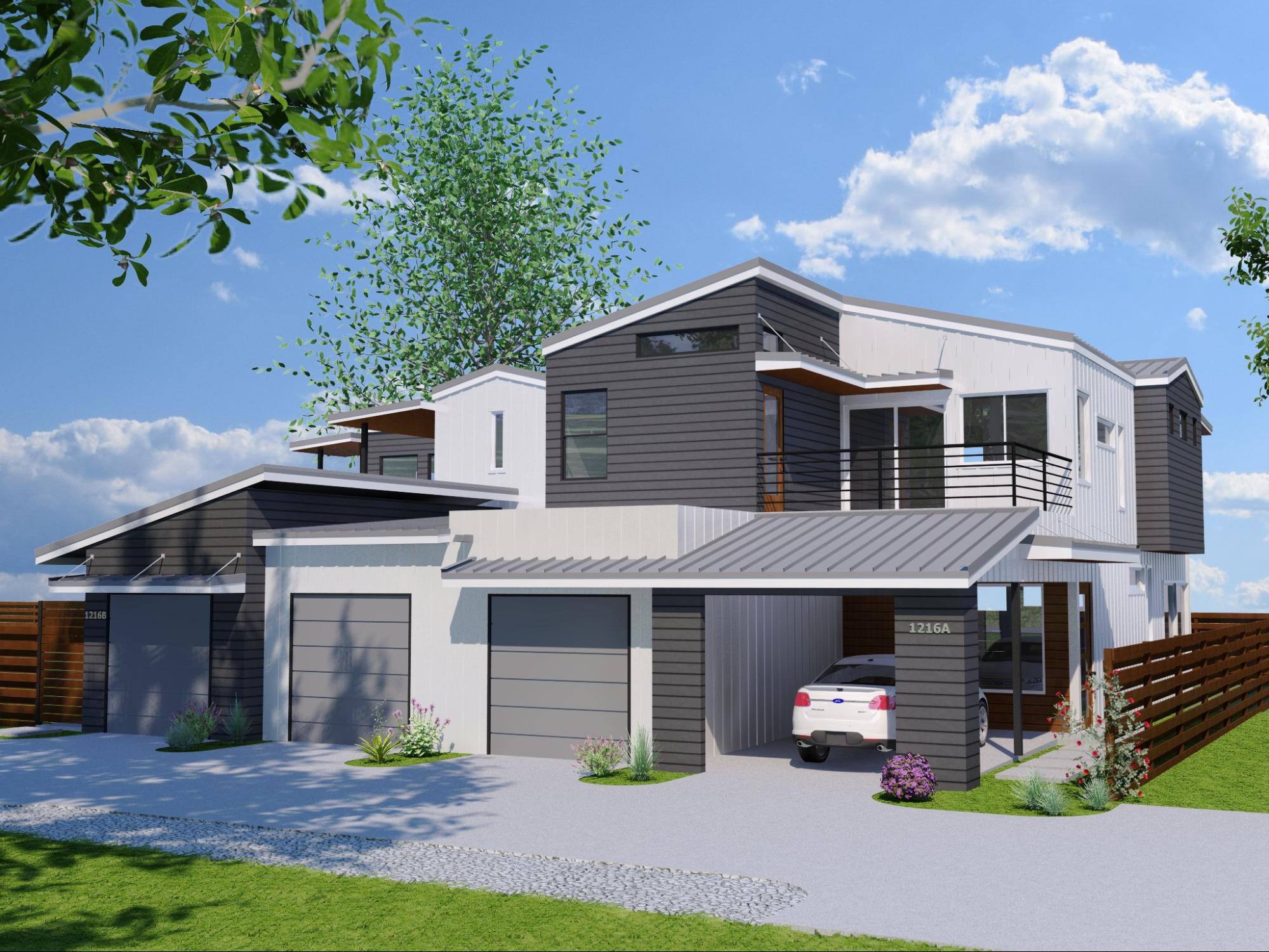
Final render before post-processing:
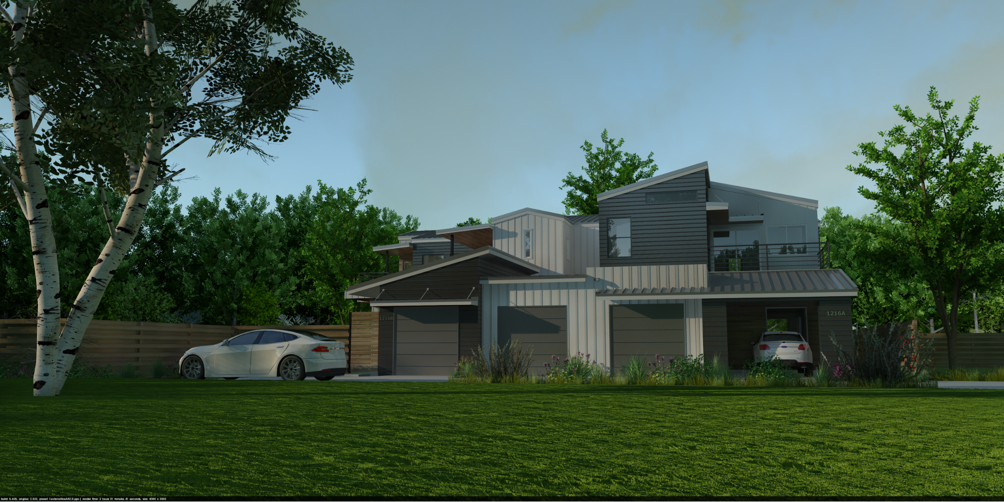
Here’s the final render render with Exterior_Fine AA. All the vegetation took a toll on render time using the fine AA setting. I rendered with my usual 4000 X 2000 pixel setting for final exterior renders. Resolution is big enough for large print, and if you size it down in half it improves edge smoothing (Anti-aliasing, or AA) for visualization on computer screen or TVs.
Post-processing (AKA the wow factor):
You are only as good at PP as your eye training and experience allows you to be. There is no definitive setting or "recipe" that will make any render look great. Every render is different and although you may keep the same workflow, it always need to adjusted to the image. Your eye is your only gauge, and the more you practice, the better you will become.
It is very easy to ruin your render with post-processing. This is why we won’t be adding any background image or 2D people. We are strictly using browser assets. Like all things, begin slow, make subtle adjustments and don’t over do it. Train your eye with photography, cinema, and practice.
If you look at the original render, the added sky image is too dark not positioned correctly. Sky brightness should be the same as your raw render, and the sky image should fade to white towards the horizon, just like the original render. Those points are easy to miss for someone new to rendering or PP, and often contribute to the "My render doesn't look realistic and I don’t know why feeling".
Another advice I can give is: Let it rest. When I work on important visualisations for my firm, I do the best PP I can, and then come back to it the day after. It is particularly important when doing photo-matches where lighting, colors and perspective have to match perfectly to look convincing.
Let's open our scene in PIE and make some adjustments:
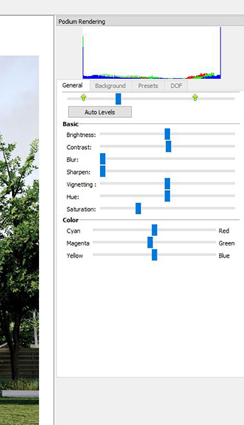
I fiddled back and forth those settings gradually until I was happy with the result. Then, picked up a glass of water, looked pensively through the window for a few minutes, and went back to it. Squinted my eyes, zoomed in, zoomed out, made subtle changes then clicked apply. I also added a slight depth of field effect using the tools in the DOF tab, and cropped the image to adjust framing.
And once again, here is finished image.
The result is nowhere near perfect. But it is something I’d be comfortable printing on a small board and showing to clients.
Get in touch!
We hope you enjoyed reading the tutorial and learned a technique or two that you can apply to your own images. If you have any questions, suggestions, or think you might like to volunteer one of your images for the tutorial series, please don't hesitate to get in touch!
You can always reach a Podium team member on the forums, and there is a stickied thread here where you can submit images for the series if you have an image you aren't satisifed with and need help improving. Our goal is to choose one image per month and publish before/after tutorials on a regular basis.
Additionally, if you have a specific question for Nick about this tutorial, feel free to contact him via email. Thanks for reading!