- SUPlugins Home Page
- Help Video Tutorials
- V2 Plus: New, free
- Operating SU Podium V2
- 1. Install
- 2. Activate License
- 3. Render process and getting started
- 4. Download and samples to test
- 5. Where to get Support
- 6. What version do I have?
- 7. Check List to help Support.
- Options Menu
- Apply Material Properties
- Lights
- Render, OOPR, Preview
- Other items in the pull down menu
- Other Features
- 1. Podium Browser: Light Fixtures, Plants, etc.
- 2. Omni Grid V2
- 3. Podium::Render script
- 4. Podium Styles
- A summary of Tutorials
- FAQ and trouble shooting
- Migrating from Version 1.7.3
- SU Podium V2 Books
- Software End User License Agreement
An Introduction to Photorealistic Rendering in SketchUp, using SU Podium
| French Translation by Pilou |
This is the first in a series of articles which will go through how to produce realistic renders. Each article will focus on a particular aspect or rendering, and how to use Podium to deal with each of these aspects in terms of creation of a realistic image from a very simple scene.
Part 1, Overview
If you are still reading, you will not only be interested in creating more realistic images of your SketchUp models, but you will also have a reasonable attention span! Some issues benefit from a little detailed explanation, but in all cases we’ll try not to go into any more detail than absolutely necessary.
It is aimed at the beginner to intermediate SketchUp user. It assumes you will have a degree of familiarity with SketchUp, and will be using groups, components, and drawing to scale. If you aren’t using these features in SketchUp, you need to learn how to use them, they are essential to effective modelling and rendering. It will take you from creation of a simple model, to rendering a fairly realistic image, by covering all the fundamental aspects of rendering.
First of all, what do we mean by ‘photorealistic’ rendering? This question is not as easy to define as you would think. At its simplest, one could define it as the creation of computer-generated images which look like photographs. This is very, very difficult indeed. It depends on accurately simulating the appearance of material properties, geometry, lighting, and camera effects. There are some excellent examples here.
The basics to creating great renders are to use high quality textures, an appropriate level of detail, and to set the lighting up correctly.
If we first consider materials, you might think that objects only have a very few basic properties like surface roughness or smoothness, colour, transparency and reflectivity. This is only partly correct as we will see later.
With geometry, real objects have lots of irregularities, some are immediately evident, like warping, cracking, bending and misalignment. Others are very subtle and might not be immediately apparent if you aren’t looking specifically for them. The most obvious example of this is edges. Most people will model these as simple extruded shapes with sharp corners. If you look at a table for example, where the top meets the edges, there will almost always be a slight rounding. It’s not sharp like a knife edge, there is a small curve. If you look at Figure 1 below, you’ll see that both the table and the tissue box don’t have sharp edges, and there is a soft blurred or highlighted edge instead of a sharp one.
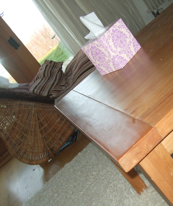
Figure 1. example of soft edges
This changes the way the light falls on and reflects off surfaces. Little details like this can make a noticeable difference. Simulating this accurately would be very complex and time-consuming, but there are some tricks to getting great results without overdoing the detail.
With lighting, there are two basic types, direct and indirect. Direct lighting comes straight from the light source, indirect lighting is when the light bounces off surfaces onto neighbouring surfaces, causing shadows and illumination where you might not quite expect to find them. Figure 2 below shows both direct and indirect lighting.
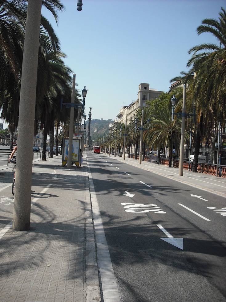
Figure 2. Direct light
Figure 3 below illustrates indirect lighting very well. There is no direct sunlight at all, but the indirect light from the sky is bouncing down the deep narrow gap between the buildings and illuminating the walls, the street and even the underside of the balconies!
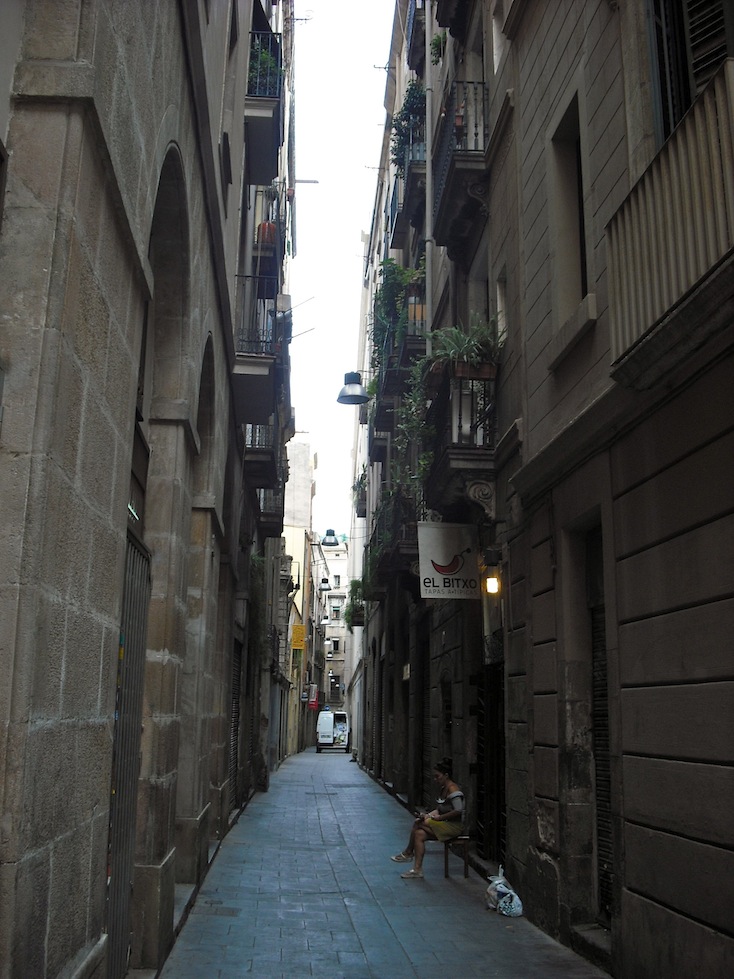
Figure 3. Indirect light
If you want to create really good renders, you need to balance direct and indirect light.
Finally, with photographs, there are particular features that are introduced by the camera that influences the final image. For example there might be lens blur, lens length or camera flash.
Simulating these things accurately involves a fairly detailed knowledge of each element, which is a lot of learning, yet people produce supposedly photorealistic images without all this detailed knowledge. How is this so?
To go back to the question posed earlier, “What do we mean by photorealistic rendering?”, the short answer is that in computer generated imaging, the term ‘photorealistic’ is relative, and is generally used to refer to the creation of images that look realistic as opposed to identifiably computer-generated. The main SUPodium home page movie rather conveniently shows this very clearly and Podium has been designed to make the creation of these types of image as quick and easy as possible.
The next article will deal with the creation of a simple scene for rendering, which will be used to explore the principles outlined above.
Happy rendering!
| Back to the Top |
Part 2: Textures
This is the second in our series of articles which will go through how to produce realistic renders. Each article will focus on a particular aspect or rendering, and how to use Podium to deal with each of these aspects in terms of creation of a realistic image from a very simple scene.Part 1 was a general overview, this article goes into more detail about Part 2, Textures.
Good textures are vital to high quality renders. Generally speaking, the better your textures, the better your renders will be. They can make up for lack of detailed geometry in a scene, and this is particularly evident in computer games, where polygon count needs to be kept as low as possible to improve performance and increase the amount of detail in the scene as a whole.
We’ll start by taking inspiration from a photograph. Modelling photos is a great way to develop your skills.
The photo below was taken from the Architecture and Design blog The Absolution.

Figure 1. Source photo
We are not going to try to duplicate it exactly, because modelling the furniture is going to be an exercise in itself, and rather more complex than necessary for a basic introduction!
I have modelled the basic structure which you can download from here. I have applied the standard glass Material from the free section of the Podium Browser, and a water texture from SketchUp’s standard library. (Automatic materials in the Podium Settings dialog is on.)
Before we add textures, this is how it renders with the clay option turned on.
Figure 2. Untextured clay render model
I have used the 1.0.5 exterior default preset and turned sun intensity and exposure sliders right down because the render will be too bright for clay renders. I have turned the physical sky off for now.
It’s close enough for the moment, so we’ll start to add some textures. To start with, let’s use some from the Textures folder of the Free section of the Browser. I have applied a stucco texture (stucco_02) and a concrete texture (concrete_09) for the floor and a tile texture (tiles_44) for the interior floor. First of all you’ll need to scale the textures up a little. I’ve used a scale factor of 500mm.
I’ve assigned a little bump (value of 20) to the stucco and concrete, and blurred reflection (D/T/R 90/0/10) for the tiles.
The textures in the Free section are pretty good in that they are mostly seamless. However you can see that they have noticeable patterning. Let’s render this and see how it looks. First we’ll need to reset the Sun Intensity and Exposure sliders and turn Clay off in Podium Settings.
So, although they don’t have ‘seams’ in the sense that you can’t see the edges of the image being tiled, they aren’t truly ‘seamless’ in the sense that you can see repeated patterns caused by patches of light and dark in the texture.
The only way to cure this is to either modify the texture in your image editor, or use a larger or genuinely seamless texture.
I spent some time using Google image search with a large size filter for the term ‘plaster texture’ and found something much more suitable on dextroduction. A little work in Photoshop with the high pass filter and the clone brush to remove the vertical and horizontal seams, and we have something a little more convincing.
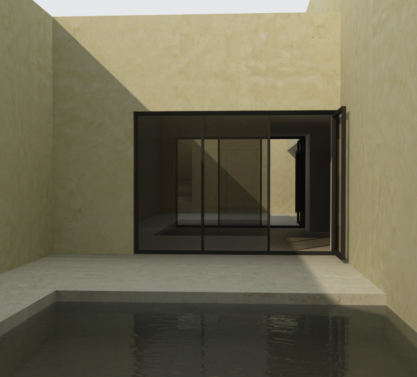
Figure 4. Render of re-textured model
In the original image, the water is darker. This means it is either reflecting dark colours or the pool tank below the surface is dark. Considering the colour of the sky and the brightness of the scene, it is most likely to be the latter.
Let’s see what we can do to fix this. Let’s move the water plane upwards and re-texture the inside surface of the pool with a darker colour. Let’s try a popular choice for pools, blue mosaic tiling. From the Podium free textures section I have used tiles_25. Let’s see how this renders.
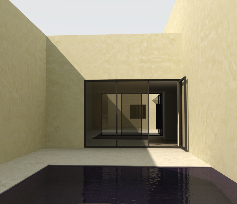
Figure 5. Render of textured model
This is looking pretty good for the moment. The wall and floor textures are reasonable, the pool is looking a little better, and the whole scene is starting to look reasonably like the source image. We’re effectively done with texturing for the moment.
The next article will try to get even closer to the source image and deal with lighting.
| Back to the Top |
Part 3: Lighting
-
This is the third installment in our series of articles which will go through how to produce realistic renders. Each article covers a particular aspect or rendering with Podium to create a realistic image from a very simple scene. As mentioned in the last article, this tutorial is definitely not about getting something indistinguishable from a photograph, it’s about creating an image that looks convincing, to learn about how to approach rendering.
The basic principles of rendering (textures, lights, detail) are easy enough to grasp, but knowing exactly what this means in terms of setting up your scene for rendering is not quite as straightforward. These articles don’t deal with creation of jaw-dropping, stunningly realistic images, that takes a lot more practice and attention to detail. These articles are aimed at taking novice or intermediate users up to a decent level of proficiency that they can use for general rendering, or use to build on to push their skills further in pursuit of even higher standards of realism.
There are two basic types of lighting, direct and indirect. Direct lighting is where you have a light source which casts light in a straight line from the source. This generally creates sharper, more clearly defined shadows, and all other things being equal, is brighter than indirect lighting.
Examples of direct lighting are the sun and light fittings.
Indirect light is bounced (or reflected) off something else and onto an object. Most surfaces reflect a proportion of light that falls onto it. In fact there aren’t many surfaces that absorb all light.
Indirect lighting is the reason that rooms are not completely dark apart from the patches of light cast by the sun that enter through windows.
Figure 1 (porto Covo Palace in Lisbon, more info here) below shows a very good example of both direct and indirect lighting.
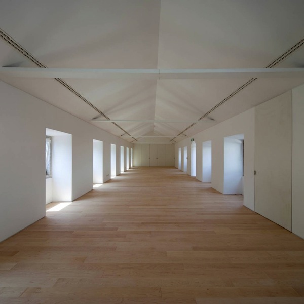
Figure 1. Interior with both direct and indirect lighting
On the left hand side of the photo you can see the patches of sunlight which is direct light. However the left hand wall and the ceiling are both illuminated, and there are shadows on the ceiling. You can clearly see that shadows are cast by light coming in through the windows on both the left and right hand sides of the picture. You can see that the light on the left is clearly stronger than the light on the right, but where is the indirect light actually coming from?
Figure 2 shows this in a visual way.
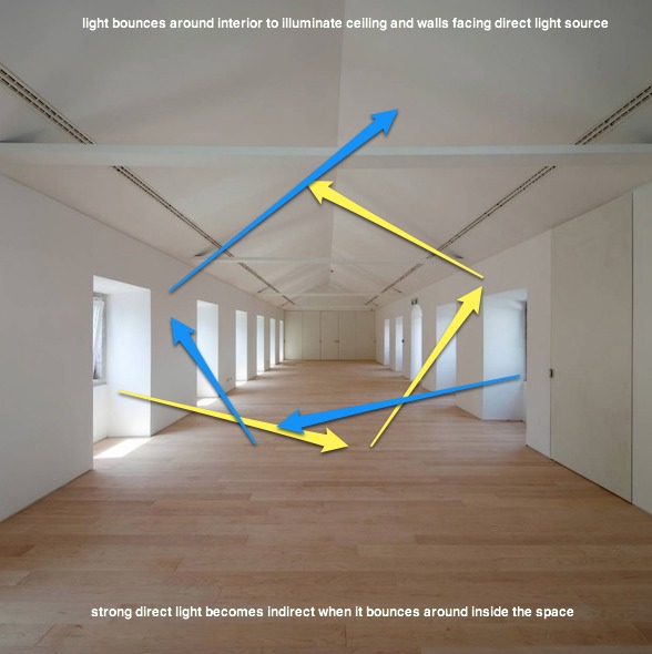
Figure 2. Simple analysis of light sources
Generally sunlight bounces off clouds, the atmosphere as well as other surfaces.
If we go back to the the test scene, we can see that the scene is lit mostly by indirect light. You can see that there is a cloudy overcast sky, which generally means that sunlight will be diffused by the clouds, shadows will be softer and less intense, and light will not be as strongly directional. In addition, the light is bounced off the light coloured walls to create an evenly-lit scene.
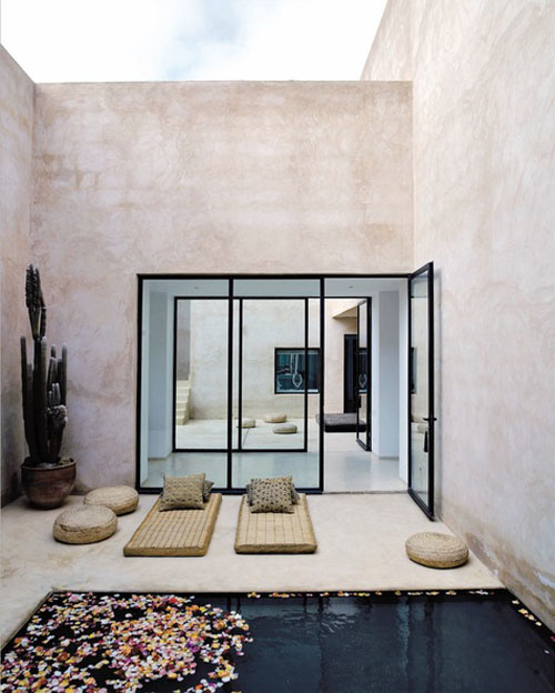
Figure 3. Original source photo
If we take our textured test model - downloadable from here, turn the shadows off and render it with the 1.0.5 exterior_default preset, we get the result shown below.
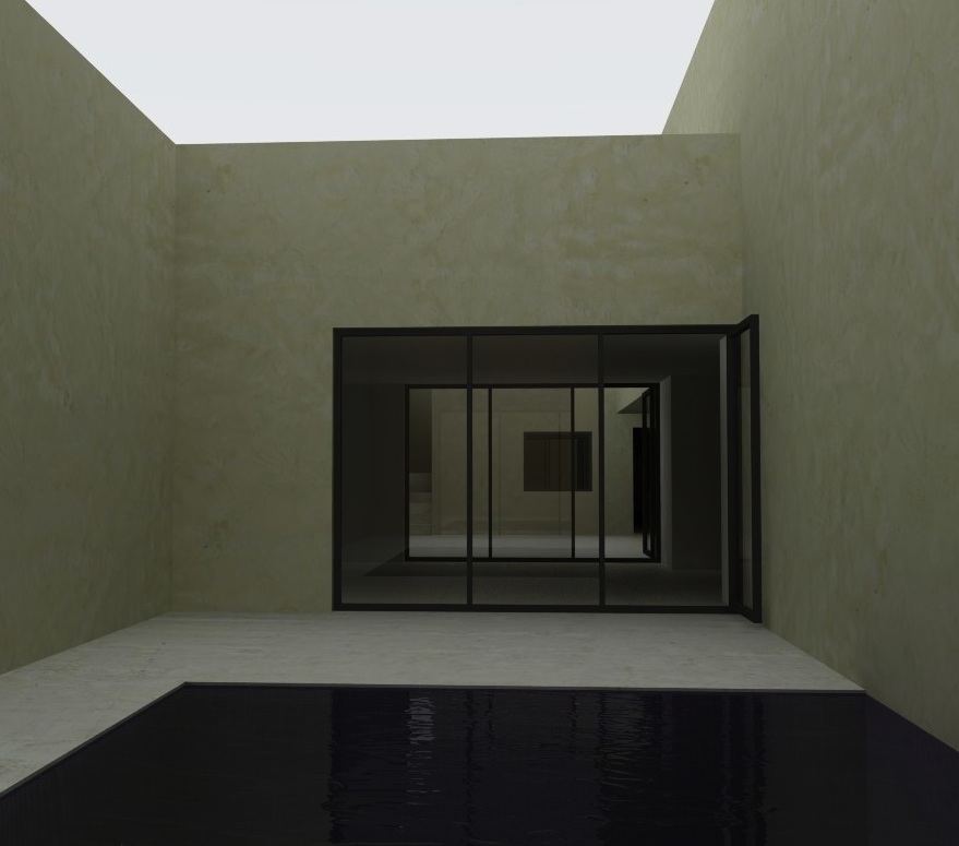
Figure 4. Rendered image with 1.0.5_exterior_default preset
The most noticeable thing about this image is that it’s too dark compared with the source image.
Note that the physical sky only works when the shadows are turned on, and when there is no sun in the image, the sun intensity and exposure sliders don’t work.
We don’t know whether the photographer has post-processed the source image to adjust the exposure brightness or contrast, so what looks to be a ‘realistic’ image (because it’s a photo!) may actually have been enhanced. We can do a similar thing and adjust the image with an editor.
About 30 seconds work with the Mac’s built-in image editor in Preview gives us the result below. For Windows users, you can open the image in MS Office 2010 and apply similar color filters.
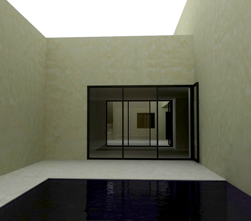
Figure 5. Above image with post-processing.
This isn’t too far away, and the easiest solution would to spend a little more time with adjusting the lighting and colour balance to get it closer. However, this wouldn’t be much of a tutorial if we simply left things there!
Let’s try to use a different preset and see how that changes the image. We’ll try using the 1.0.5 interior_default preset. This seems counter-intuitive. Why do we want an interior preset with an interior scene? Won’t it be too bright? The interior presets boost the overall ambient lighting levels, which you need for interiors.
Figure 6 below shows the result.
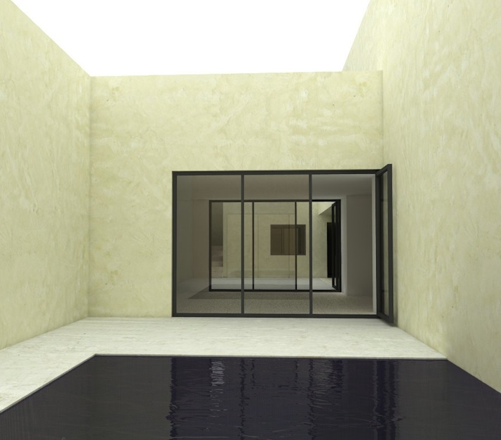
Figure 6. Render with 1.0.5 interior_default preset
This image is noticeably brighter than with the exterior preset, but it’s not too over-exposed.
The walls are a yellowish colour which doesn’t quite match the source photo. We can fix that.
You will notice that without the Podium physical sky, we have no sky colour. Let’s make sure the ‘Podium Physical sky’ box is unchecked (it doesn’t make any difference with shadows turned off, but for the next stage, we want to make sure it’s turned off.)
We’ll set the SketchUp background to a solid background, instead of a SketchUp gradient ‘sky’. Let’s choose a light blue colour and render.
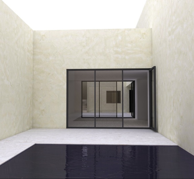
Figure 7. Same scene as above, with blue SketchUp background colour
Not bad for 1 minute and 45 seconds on a laptop!
To get the sky, let’s try using the transparent png option. In Podium’s Settings dialog, Switch to the Output tab, choose the png format, and check the ‘Transparent’ box.
This effectively ‘cuts’ out the background sky, so it’s easy to add a background in Photoshop or most image editors that support transparent .png.
I have added a sky I found on allcgextures.com and tweaked the levels a little. Figure 8 shows the final result.
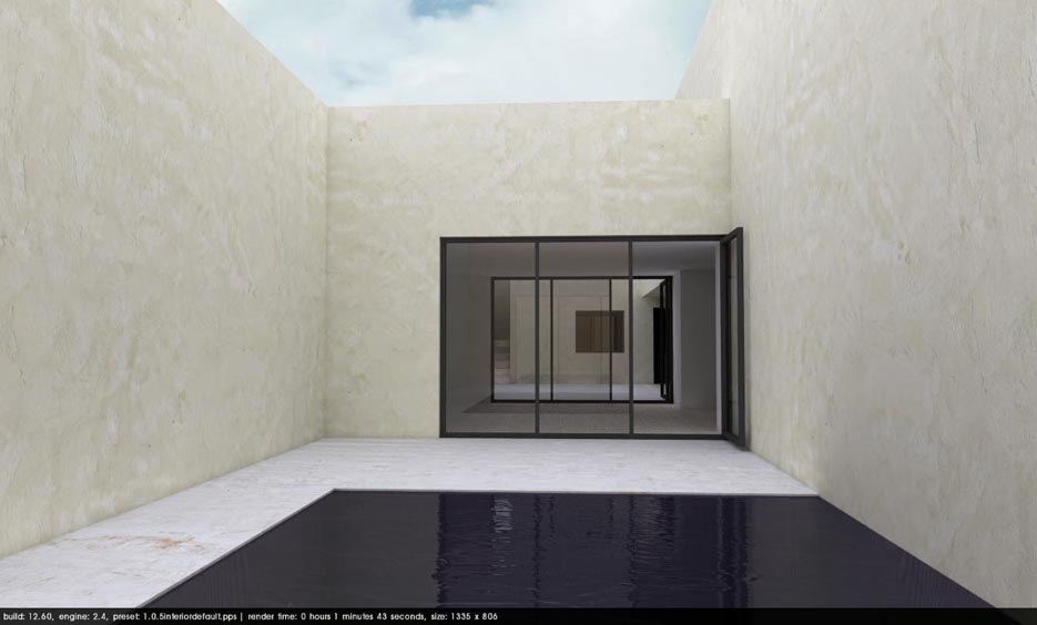
Figure 8. Same scene as above, with Sky image for the background.
It’s not an exact copy by any means, but it’s a fairly realistic approximation of the basics.
Although we have a solid base to start working with, it’s also important to realize that we’re not done yet!
We have covered textures and lighting, the next articles will deal with geometry detail, and adding additional touches to the model and rendering night scenes.
| Back to the Top |
Part Four: Geometry Detail
This, the fourth installment in our series of articles on creating realistic renders deals with modelling. We have already covered the basics, lighting and texturing, this time we are covering the the level of detail in your model, based on a very simple scene.
To reiterate the points made in previous articles, this tutorial is definitely not about creating a render which is indistinguishable from a photograph. That is difficult and requires a much more in-depth approach, and much more attention to detail. These tutorials deal with creating convincing images, to start people thinking about how to develop their skills to improve their Podium renders.
It ought to be obvious that you can’t start out with the very simplest of models, texture them nicely, set up the lighting properly and you will end up with something that genuinely looks real.
The Podium Browser makes it easy to set up your materials, and add good render-ready components, however this doesn’t mean that you don’t need to put in much effort with the base model!
It’s not particularly perceptive to say that there is a balance to be struck between adding massive amounts of detail to everything, and adding hardly any. The closer you are to the model, the more detail you need. Similarly, objects further away from the camera need less detail. 3d games engines have components which have different levels of detail, which are switched on and off based on the distance from the camera. The fully-detailed trees with all the leaves and branches turn into 2d billboards when they are distant.
When working out how much detail to add, you also need to think about exactly what you want to achieve. The more realistic you want to get, the more detail you need to add, but the longer your scene will take to render.
I think that for most people, a simple principle is to use only as much detail as you need.
It takes a little time to work out what this is, and it is different for most people. Generally people tend to render a particular type of scene for a particular purpose, so once they get an approach they are happy with, they will tend to use the same approach for every scene.
This article focusses on lots of little things that people miss.
This is the scene we are trying to copy.

Figure 1. Original source photo
This is the scene we ended up with at the end of part 3.
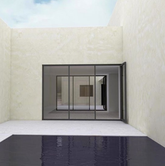
Figure 2. The pool scene after texturing, lighting, and adding the background in post-processing
It’s a reasonably realistic starting point, so let’s add some detail and see how we get on.
First of all I’m going to round the edges of the pool surround. In reality, not many surfaces have really sharp edges. If you think about it, sharp edges generally occur when materials are cut and/or ground. Wooden items can have sharp edges when cut, but you almost always have a slight rounding applied to them to prevent the sharp edges splitting. Items that are moulded, almost always have rounded edges, because most moulding processes aren’t accurate enough to get really sharp edges. Cast glass tends to have smooth ground edges to prevent people from cutting themselves. You’ll find the same thing on plastered walls.
The significance of this for rendering is that slightly curved corners reflect the light in a subtly different way. You don’t necessarily notice this unless you look for it, but the softness and realism of the edge highlights will make a difference in virtually all of your scenes.
The image below shows a new component for the browser, the Ikea Hol table.
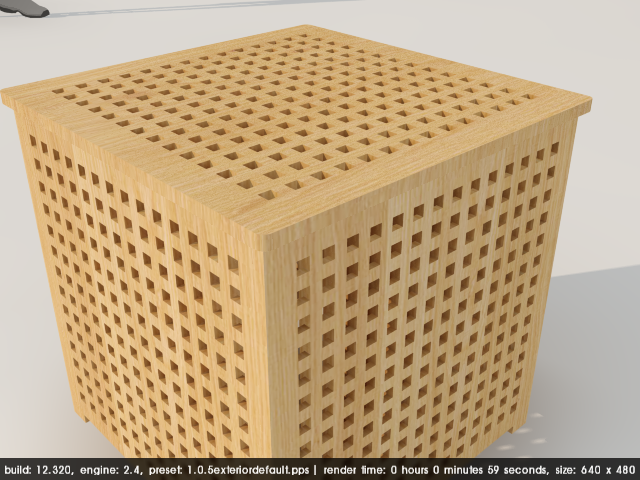
Figure 3. The Ikea Hol table component, modelled and rendered simply
This component has been built as simple extruded surfaces with holes, and the texture applied to the whole component. It looks okay, and if you see how it looks from a distance, you can’t see that it’s not very sophisticated.
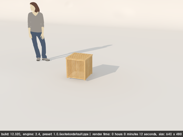
Figure 4. The same component rendered from a distance
Render time with this simple component is pretty good, however the close-up view isn’t good enough for a realistic render.
The first thing we need to do, is work on the texture. In reality, the wood grain virtually always runs along the long direction of a component. You can see the real photograph here. You can clearly see that the table is made up of individual pieces of wood, fitted together. Look at the direction of the wood grain. Let’s modify the component to show this.
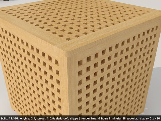
Figure 5. The same component modelled with individually-textured components
This is a big improvement, and render time has increased, but we can do better. Look at those sharp edges at the top and on the corner. Let’s soften those. I use the Roundedge plugin by Fredo downloaded from the ‘Plugins’ section of the SketchUp forum. This makes adding bevels and curved edges very quick and easy. It works fine with Podium and it’s one of my most frequently-used plugins.
The trick is to make sure you don’t add too many polygons unnecessarily. I have applied a 0.5mm edge with a single segment, (effectively a chamfer) along the vertical corner member.
to the lid I have applied a 2mm rounding with 2 segments. The geometry has been smoothed to make the curves look more natural and help with texturing.
I have also added tenon joints at the top, where the timber sections join. The render for this is shown below.
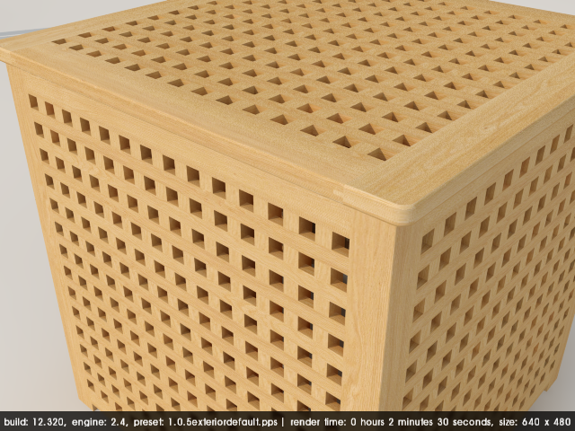
Figure 6. The same component with rounded edges
Render time has increased again, but the component looks much nicer. each of the elements is a component, which keeps the file size down for the Browser. We could improve the component even more by creating more variations on the slat members, and changing the texture, so that the wood grain is more realistic and less regular. You can particularly see the subtle highlight on the top edge of the lid and the tenon joints. With a little more texture variation, the component would look even more realistic.
Having demonstrated the point about texture variation, detail and curved edges, let’s return to our test scene. Concrete generally has slightly rounded edges, because it tends to crumble when too thin, and ‘normal’ construction concrete doesn’t have sufficient strength to keep really sharp edges.
I have softened the edge of the pool and the copings around the roof. Let’s also add some skirting boards internally, and some door handles.
The next stage is to add the furniture. I spent a little time building some similar items, and found a cactus model on 3DW which I textured and modified. The petals are dynamic components I built and distributed manually in a similar way to the photo.
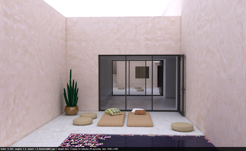
Figure 7. The base model with more detail and additional furniture components
This scene has been rendered with the QMC preset, with the Podium physical sky on, and the transparent png background option. It’s not bad, but it we look at the door threshold and the amount of light inside the room, they are not quite right.
To increase the light inside, there are 2 options, cutting openings (because we don’t know how where the light comes from in the actual building in the photos) and adding LEMs. I have chosen the first option. You will also notice the area of wall above the lower roof on the right is a little overexposed. To fix this, I have darkened the colour of the roof, which will bounce less light off it and help to reduce this. You can download the modified model from here.
Download the Final Pool model here.
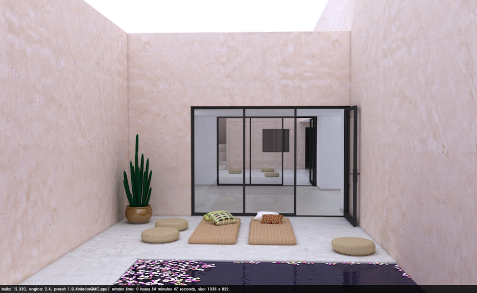
Figure 8. The same scene with additional lighting introduced into the interior space
This is a definite improvement. However we still need to add the sky in post-processing. At the same time we’ll adjust the brightness and contrast, and resize the image, because the QMC presets introduce noise or ‘graininess’.
The final image is shown below.

Figure 9. Final render with post-processing
We have adjusted the colour balance, saturation and contrast, and added a border.
The image could undoubtedly be improved even more with more sophisticated post-processing. With a solid understanding of blend modes, adjustment layers you can significantly improve any image. I’m not very good at post-processing, so I tend to limit this to the basics!
It’s not an exact replica of the original scene by any means. In particular, the wall texture and floor textures are much cleaner, but it’s a decent image, and shows how that to make your images that little bit more realistic, the better they get, the harder you have to work to improve!
So far we have covered all the basics of rendering. These tips will not turn you into a PeterGuthrie or a RonenBekerman, but they will help you start to improve your renders.
In the final article, we’ll try to create a convincing night version of the render.
| Back to the Top |
Part Five: Night Rendering
This is the final document in our series of articles on creating realistic renders with Podium. Previous artcles took you through lighting, texturing and levels of detail. This final part deals with night renders.If you have been following the series, you will see how we started by trying to learn by copying from a photograph. We started with a very basic scene and gradually added more detail to it, carefully observing the source photograph, and trying to emulate it.
As we stated in all the other articles, the series doesn’t deal teach you how to create a proper ‘photograph type’ realistic image. They are starting point for people to create really good renders as a starting point for people to develop their skill levels.
Night renders are images that many users struggle with. We are going to adapt our scene to create a night image.
Previous articles have involved adding content from the Browser. This time we aren’t doing this, we are going to rely mainly on adding LEMs to simulate indirect lighting from sources which aren’t in plain view.
This tutorial will just cover the basics of setting up a night render, and give you some basic information to experiment further.
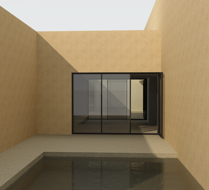
Figure 1 below shows what we have got so far. It’s a simple, fairly convincing daytime render. Let’s start to turn it into a night image.
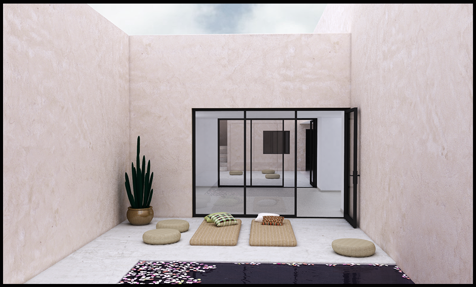
Figure 1. Final render with post-processing
The starting point for a night render is to set a dark background colour in SketchUp. The Podium physical sky only works for daylight hours, so for night renders we have to rely on SketchUp’s background options. By default, the most recent versions of Podium come with some background styles for night renders. If you go to SketchUp’s Styles palette, you should see a category labelled ‘Podium’.
There are a number of night styles to choose from, with varying degrees of darkness. Figures 2 and 3 show how they render. In these images, we have set the sun brightness and exposure sliders to their minimum values.
Let’s start with the the ‘Dark night’ Podium style. Select this as the SketchUp background in the ‘Styles’ dialog. Turn the sun off and render with the 1.0.5 exterior preset

Figure 2. Render using the ‘Dark night’ SketchUp background style from Podium
That’s pretty dark, and there are no lights in the scene, so all the light is coming from the sky, which is black!
When we choose the ‘Night_1‘ style, we can see from figure 3 below that we can make out some details in the scene. Because the background is lighter, we have more light bouncing around the image illuminating the details.
How much detail you can see in the scene will depend on your monitor’s gamma settings, and the angle at which you view the image on your screen. Although this sounds strange, if your monitor is reflecting too much ambient light around you, you won’t be able to pick out the contrast and the details in the render. You should be able to see the pool, the plant in the corner, the glazed screens, and you should be able to just about make out the square window right at the back of the scene.
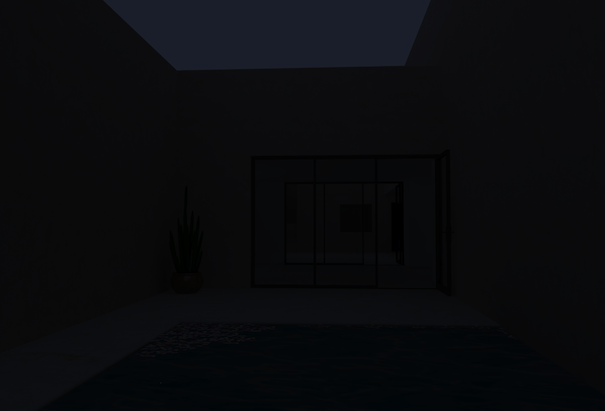
Figure 3. Render using the ‘Night 1’ SketchUp background style from Podium
Let’s add some light sources. The easiest way to do this is to add LEMs out of sight to simulate light sources which are not visible in the scene. I have added individual large LEMs with a strength of 40 out of view. There is one in front of the walls to the left and right walls, and one in the room at the far end of the view below the ceiling.
I have also made them invisible in case any of the edges show in any views.
LEMs are generally much better than omnis for this. They produce softer more subtle light, and you need fewer of them.
This is how the scene renders with the LEMs.
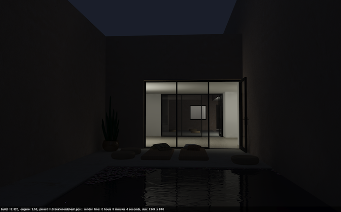
Figure 4. Render with ‘Night 1’ background style, with LEMs inside the building
You might want to experiment with the LEM light strength until you are happy with the effect.
You can see how the light floods out of the openings, bounces off the walls and the water, and is casting a shadow on the wall behind the cactus plant. This scene uses only 4 LEMs inside the building to light it. There are no light sources at all in the front courtyard.
Now that we have some light sources in the scene, we can switch back to the ‘dark night’ style, and see how that renders.
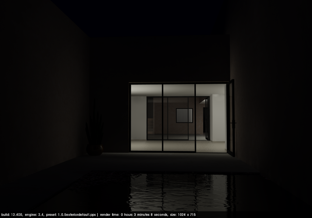
Figure 5. Render with ‘Dark Night’ background style, with LEMs inside the building
We can see that the sky is much darker, which might be more appropriate for areas in the countryside late at night, where there is less light pollution, and all the ambient light is from the stars.
Obviously the sky is seldom completely black, so we will want to add a background. Let’s use the transparent png output option, and add the background in post-processing.
The transparent png option produces the image shown in Figure 6 below. The white ‘sky’ is actually transparent, and the page background is showing.
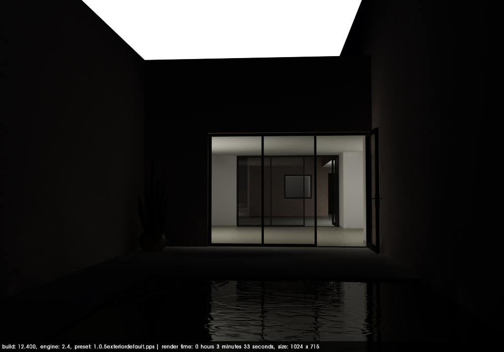
Figure 6. Render using transparent png background options
We can go into our image editor, and paste a night sky photograph into the background to produce an image like this.
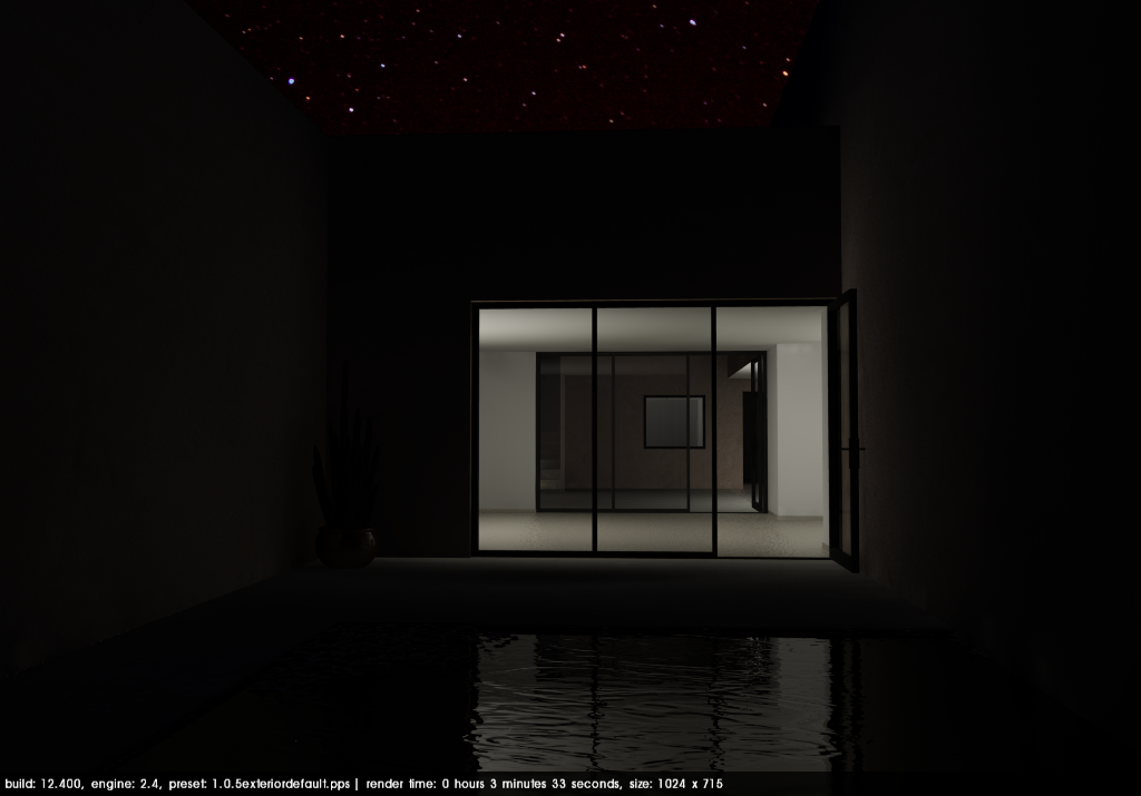
Figure 7. Image with ‘Dark night’ style and post-processed night sky
This works reasonably well, because the background in the starry sky is similar to the original plain SketchUp background colour.
Many people might think that night skies are simply dark blue or black, but there is a lot of beauty and subtlety to them, and choosing the right one to match your render is very important. If we go back to the ‘Night 1’ style and render with the transparent png option, we can see the different effects achieved by using different background images.
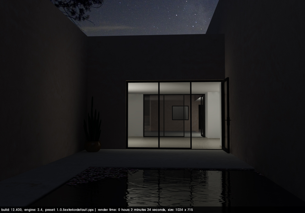
Figure 8. Image with ‘Night 1’ style and post-processed night sky
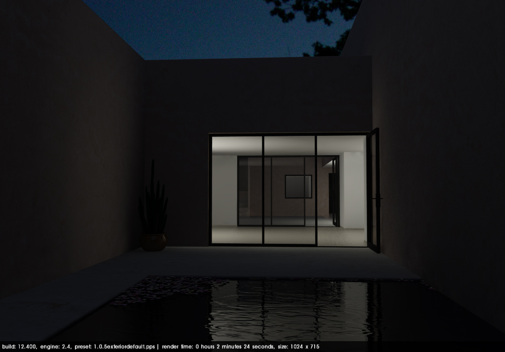
Figure 9. Image with ‘Night 1’ style and alternative post-processed night sky
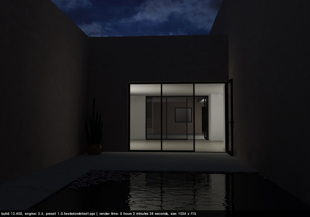
Figure 10. Image with ‘Night 1’ style and alternative post-processed night sky
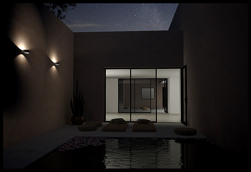
Let’s add the furniture back in and add some light fittings. I’ve added two Optelma Taso3 wall lights from the free fittings section.
The first image below shows the complete image, with an added background, using the default option for soft omni lights, which is to disable them..
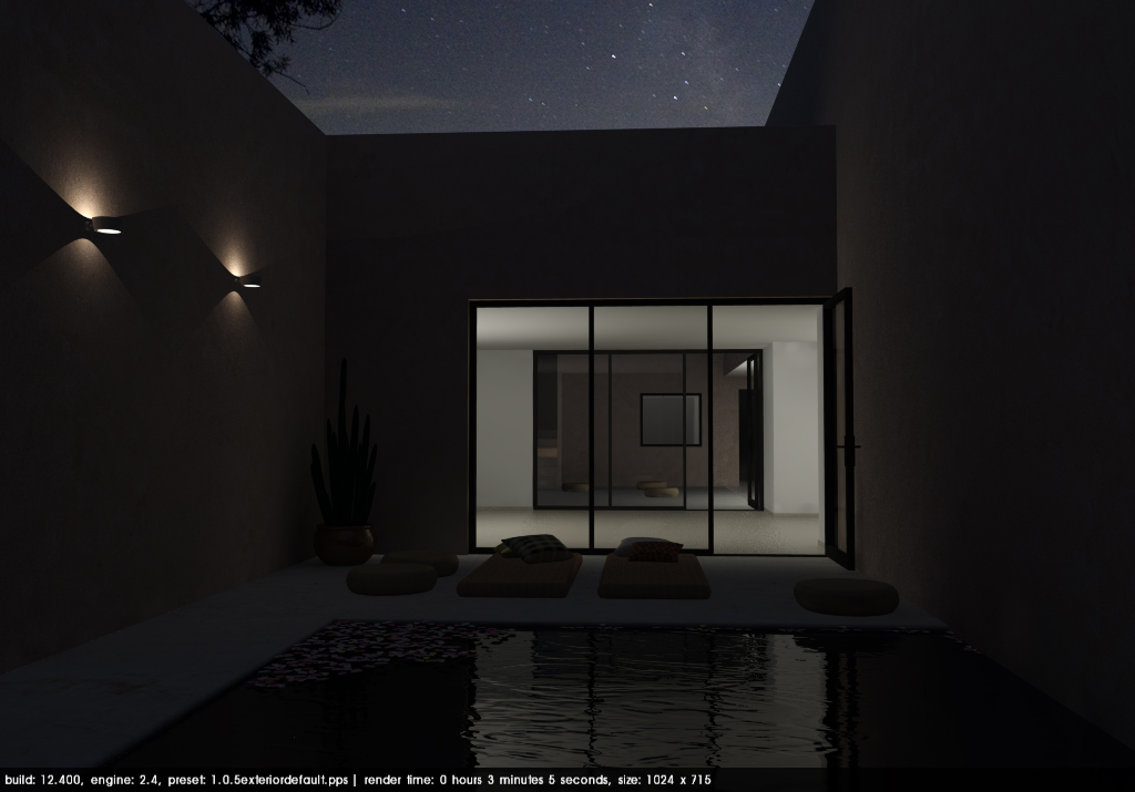
Figure 11. Image with light fittings - soft omnis off
Let’s turn on soft omni lights and see how this changes the render.
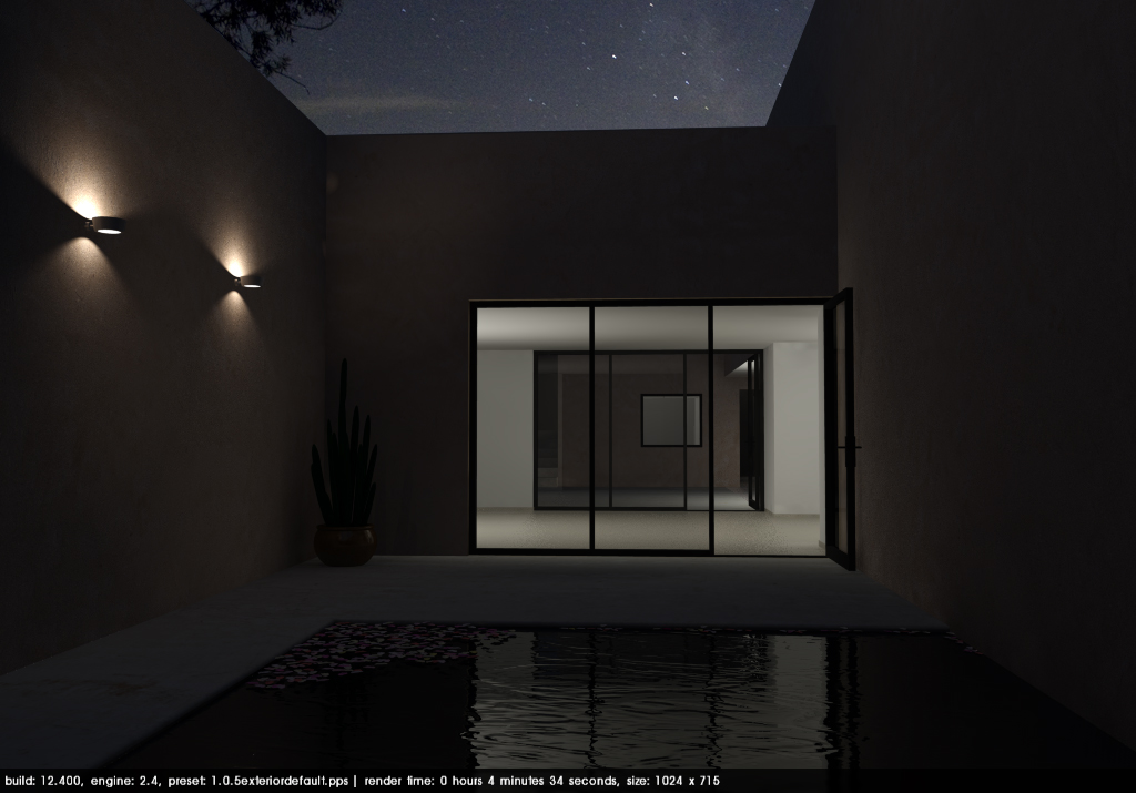
Figure 12. Image with light fittings - soft omnis enabled
You can see that the overall illumination level is slightly higher, with a broader spread of light, and the the falloff of the light is softer in the second image. It’s a slightly nicer image, but render time has increased from 3m5s to 4m 34s. An increase of 33 seconds even without all the furniture seems a lot, but render speed can vary even if you render exactly the same scene several times. It depends what background operations or programs are running. Although the quality increase in this image is marginal, different fittings will produce different results.
Turning on soft omni lights is a global setting, so before you enable this option, you ought to test render speed with just a few fittings first and carefully assess whether you think it is really worth the extra render time.
It is worth underlining that adding lights, particularly in conjunction with lots of reflective surfaces, can substantially increase render time. We have gone from a render time of around 1-2 minutes for daytime renders, to 4-5 minutes for night scenes.
The additional render time is an indication that your hardware is working harder. More lights and more reflective surfaces increase the number of calculations that the render engine has to perform. This requires CPU time and RAM. Different presets also affect render speed.
The ‘high’ and ‘QMC’ presets require more system resources. The ‘high’ presets have enhanced anti-aliasing (edge detection and smoothing) and the QMC presets have improved accuracy but also have a slight graininess or noise to the image.
Unless you want to needlessly increase render time, only use the ‘high’ presets (1.0.5_exterior_high.pps and 1.0.5_interior_high.pps) for images where you have very fine details like shadow gaps and cables. QMC presets are for where the standard presets are creating weird splotches, or you want better accuracy and have the time to wait.
The final image is shown below with a little post-processing. You can download the scene to see how things are set up here.
Download the Final Pool (night rendering) model here.
This concludes our series of introductory articles on photorealistic rendering.
Have fun experimenting with your Podium renders!
If you have any questions, want any tips to improve or just want to show us what you can do, please post on our forum!
© 2025 Cadalog, Inc. All Rights Reserved.